Freitag, 5. April 2013

Spanish Impressionism

Welcome once again,

This time, my way lead me to Valencia, Spain. I went to visit a friend and of course as part of my mandatory city discovering program several museums were on my plan. My first stop was the Museum of Fine Arts of Valencia. Beautiful, beautiful building by the way!

Apart from the permanent collections, there was a wing solely dedicated to a Valencia-born artist. Joaquin Sorolla y Bastida (1863-1923) exelled at painting portraits, landscapes and works of social and historic themes. The exhibition showed a wonderful selection of some portraits he painted, but also some social themes. He painted in an impressionistic way, very expressive and bold, with vibrant colors. This one, painted in 1900 of Count Artal, made me stand infront of that portriat for a very long time, which rarely happens, since portrait is not my favorite medium of painting.


I love how the picture is divided into different sections by the various lines and diagonals throughout. I love the format, I love the vivid, yet rather undefined background, i love the placement of the portrayed. Beautiful picture.

But another picture I couldn't take my eyes off, was "People in frock coats playing in a garden" which Sorolla completed in 1900.


Isn't it just breathtaking?? I have rarely seen an impressionist painting with so much life in it. The colors are so rich and lush, not only in the depicted nature but also on the people and their costumes. Incredible how Sorolla captured the early autumn sunlight shining through the tall trees and falling on the playful scene. It seems like you can almost smell the freshness of the leaves, the crispness of the air this scene takes place in. What you can't see here, is the format. The picture is actually really huge so it seems, like you're standing right infront of that scene, participating almost in the joyful play. And look at that detail!! 


A true masterpiece!!

Freitag, 8. März 2013

Not ever ForgITTEN again

Fans of color, hello!

Tonight I had the opportunity to visit the exhibition "Itten and Klee" in the Kunstmuseum in Bern, guided by one of the curators herself, Monika Schäfer. 

I have to admit, I hadn't done any research beforehand and I had never heard about "Itten" before so I didn't know what to expect. Is "Itten" a place? A theory or idea? Or is it maybe another person? Pretty soon, almost immediateley it was clear to me, that "Itten" was also an artist of the same era as Paul Klee (1879-1940). Johannes Itten (1888-1967) is also, like Klee, a swiss artist from the 20th century. Not having heard from him before shamed me a little since his works, as I learned, are quite extraordinary. 

The theme of the exhibition was color itself. The cosmos of color to be exact. Both artists spent an enormous amount of time studying colors. Several rooms of the exhibition were just dedicated to show their theoretical approach on color. They both were groundbreaking in our modern understanding of color, colorschemes, colorinteraction etc. And both artists worked their findings on color and their experiments into their works. In a very systematic, almost mathematical way.

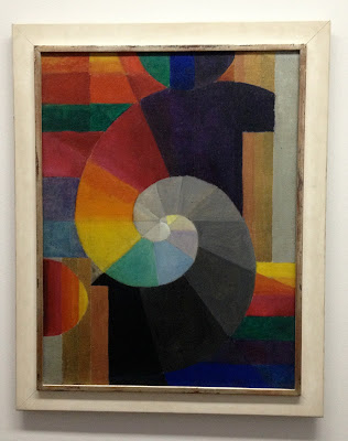
The great thing about getting led through an exhibition by someone who created it, is that you get to hear alot of anecdotes. For example one about this piece "Encounter" from 1916 by Johannes Itten. It seems quite systematic, clear composition, colorful. Eventhough you can't see an actual object or something in perticular there is a rather sad backstory. A close personal friend of Itten had taken her life, shortly before this work originated. The greyish spiral that represents the tragic loss meets the more lively and colorful spiral in an intertwined "Encounter". This piece represents a great deal of pain on the artist's part. 

Since I haven't really encountered Itten before, I will focus on another series of works by him, which I thought was enchanting. "Spring", "Summer", "Autumn" and "Winter" are four works of a series from a private collector that were created in 1963. You can again see the focus on the demonstration of colors and how they work together. Itten, more than Klee, also tried to apply the study of colors to other fields of sciences or areas of different focuses. For example he tried to categorize different signs in colors, or feelings and even traits of character. This series although represents his application of color to the different seasons of the year which in my opinion he managed to achieve beautifully. 


Dienstag, 5. März 2013

Checking out Chagall

Hi again there,

So there is a pretty big and as it seems important Marc Chagall exhibition at the Kunsthaus in Zurich. As you can imagine I was one of the first ones there. When I began my studies in art Chagall was my of my favorite expressionist painters. The colors and the melancholic tone of his pieces were always something that spoke to me. So naturally I was full of anticipation.

The exhibition was beautifully arranged, as the Kunsthaus always manages to achieve with its shows. The selection of paintings was broad and as I learned it took over two years for the curatorial team to aquire the works, coming from all over the world, from private collections, museums and galleries.

The War 1964-1966

The exhibition focused primarily on the years from 1911 to 1922, a crucial period in Chagall's artistic formation. Over 90 works trace his career in Paris and in is homeland Russia during the period of the revolution. Uniquely among his contemporaries, Chagall developed an art that articulates his Jewish and Russian culture while entering into a dialogue with the visual languages of modern art - from Fauvism to Cubism and Orphism, from Expressionism to Suprematism.

I know I said Chagall was one of my favorite artists when I started at University. But as I was looking at the pieces now I couldn't find the access I used to have to Chagall's poetic, intuitive, almost dreamy pieces of art. Before I found the famous flying cows and violin-playing goats, the floating lovers intriguing and beautiful. Now I found them rather silly, which I know I have no reason for. It all seemed more illustrative, almost childish and the colors seemed to vibrant and intrusive for me.

The Yellow Room 1911

But still, the quality of the works, the selection and the exhibition itself was great and of extraordinary quality. It was also the first time that so many works of different timeperiods of Chagall were united in one room which was a pleasure to see.


Donnerstag, 7. Februar 2013

The Picture in the Picture.

Good evening to you,

So, this is something I always love to see. When we went to the National Gallery of Art in Tirana we were browsing through the paintings and sculptures, most of them with a socialist and communist theme.

One painting although caught my eye. And it wasn't because I thought it was espeacially beautiful, but something about it seemed familiar. Then I saw what it was. In the first room I had allready seen a picture which was now included in the picture I was now looking at.


So this is the painting I was looking at. "Në studio" which means in the studio was created 1979 by Vilson Kilica, an Albanian painter. He was also the first director of the Academy of Arts in Tirana, the capital of Albania, in 1966. So, back to my discovery. Here you see a painting which shows us the studio of a painter, who is also shown here, most probably Kilica himself. He is working on a piece and there are numerous other paintings hanging on the wall. There is also another man in the painting who takes up most of the space but that wasn't what I saw first. My eye immediately went to the landscape painting in the middle of the picture. The first of the three.


It seemed familar and indeed it was. 20 minutes earlier I had seen that exact painting in another wing of the museum.


It's a painting by Vangjush Mio (1891-1957), named "Sigeni i Pogradecit" which means the lake of Progradec. Mio is one of the most known Albanian artists and he is also known as the first impressionist painter of Albania. And indeed there are lots of parallels to the famous impressionists like Monet and Cezanne. The theme of the landscape, the light, dusty coloration, the characteristic style. 

So, this painting, now at the Gallery here in Tirana, was most probably in the studio of Kilica. Of course the frame changed, but it is the same picture here as it is in the painting. Isn't that great? The artist as a collector - love it!

Freitag, 1. Februar 2013

Onufri 2012/2013

Hey again, readers.

When I was in Tirana, I was lucky enough to get a chance to see the recurring artshow the National Gallery of Albania (NGA) hosts every year. "Onufri" in its 19th edition was curated by the Italian Daniele Capra under his chosen theme "Perchance to Dream" - a verse from Hamlets famous soliloquy by Shakespeare.

Capra has chosen this title because, according to him, there is a noticeable correspondance between an anguished and confused Hamlet found in a difficult personal circumstance yet, regardless, finds strength to think philosophically about the world and its enigmas. According to Capra the Albanian artists challenge and defy the difficult everyday reality, managing to offer personal solutions.

It was set up like every current artshow. A big open room, white walls and sporadic placement of the artpieces. There were mixed media sculputures, videos, paintings, photographs, drawings... So basically everything you can wish for. The pieces were nice, although I couldn't really find the connection to the theme of the exhibition.

I really liked the photographs by Mariana Kostandini.

"Pa titul"


"Eve"

I didn't really know what to make of them though, and even after contemplating the photographs with the theme of the exhibition in mind I could only come up with this: I think the artist chose to show us how not to use a couch, which could correspond with the theme. It's funny and of course you can apply the "couch-theme" to a bigger scale where the couch could represent something else, like a government, an institution, anything really. But then again, I don't really know and I feel like I'm leaning far out the window here. But besides the difficulty of finding out what they mean, I found the photos aesthetically pleasing and humorous. Great compositions.


Sonntag, 20. Januar 2013

Happy Belated Holidays! Have some turkey!

Hey festive ones,

I wish you all a very belated but still a very merry Christmas, a happy New Year, happy Hanukkah or whatever you choose to celebrate! Oh, and also happy Birthday to my dad who went with me to see what I am about to present to you.

And in the spirit of the holidays (that allready passed a while ago, I know) I think it only makes sense to dedicate this piece of art to those festive times I hope we all were able to enjoy!


We went to see a student art show in Tirana, Albania, and this piece caught my eye immediateley. It's called "Gjeli i arte" which means golden rooster in albanian. And the young artist's name is Flogert Kola and unfortunately I couldn't find any info on this yet unknown artist.

But I thought this piece was brilliant. It's simple, it's well made, it's humoristic and sarcastic. The material is, as you can see, carved styrofoam which is an incredibly cheap material, almost garbage since it's mostly used for packaging and gets thrown away after. So it's ironic that the artist chose to use this material to display something that gets valued so much particularly during the festive season. The main attraction on the dinnertable is the turkey - that's the tradition. But then again by painting it gold, the artist gives it back some value. It may be made of styrofoam but it's golden and therefore important again. And the pairing with the festive red tablecloth gives it an impression of being displayed in a most fancy way, in the most festive way possible. And it also leads me to believe that it is an installation and not just a sculpture.

As I said, great work! And happy belated Holidays again!

Mittwoch, 7. November 2012

Tiles

How are you, dear reader?

This might be a rather unusual post, but nonetheless I really wanted to share this with you.

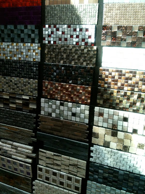
A couple of weeks ago I went to an exhibition. Wow, really? Yes. But it was not your usual art expo. No, it was a tile exhibition. I know, this breaks with the regular scheme of artreviews but it was an actual exhibition and to be honest, it was very interesting.

There were regular tiles, big tiles, huge tiles, tiny tiles, colorful tiles, ornamented tiles. So there were alot of differnet shapes, colors, materials and they were displayed like little pieces of art. So I wanted to give them the honor of not just being simple tiles for once, but to be viewed as little pieces of art.