Posts mit dem Label Exhibition werden angezeigt. Alle Posts anzeigen

Freitag, 5. April 2013

Spanish Impressionism

Welcome once again,

This time, my way lead me to Valencia, Spain. I went to visit a friend and of course as part of my mandatory city discovering program several museums were on my plan. My first stop was the Museum of Fine Arts of Valencia. Beautiful, beautiful building by the way!

Apart from the permanent collections, there was a wing solely dedicated to a Valencia-born artist. Joaquin Sorolla y Bastida (1863-1923) exelled at painting portraits, landscapes and works of social and historic themes. The exhibition showed a wonderful selection of some portraits he painted, but also some social themes. He painted in an impressionistic way, very expressive and bold, with vibrant colors. This one, painted in 1900 of Count Artal, made me stand infront of that portriat for a very long time, which rarely happens, since portrait is not my favorite medium of painting.


I love how the picture is divided into different sections by the various lines and diagonals throughout. I love the format, I love the vivid, yet rather undefined background, i love the placement of the portrayed. Beautiful picture.

But another picture I couldn't take my eyes off, was "People in frock coats playing in a garden" which Sorolla completed in 1900.


Isn't it just breathtaking?? I have rarely seen an impressionist painting with so much life in it. The colors are so rich and lush, not only in the depicted nature but also on the people and their costumes. Incredible how Sorolla captured the early autumn sunlight shining through the tall trees and falling on the playful scene. It seems like you can almost smell the freshness of the leaves, the crispness of the air this scene takes place in. What you can't see here, is the format. The picture is actually really huge so it seems, like you're standing right infront of that scene, participating almost in the joyful play. And look at that detail!! 


A true masterpiece!!

Dienstag, 5. März 2013

Checking out Chagall

Hi again there,

So there is a pretty big and as it seems important Marc Chagall exhibition at the Kunsthaus in Zurich. As you can imagine I was one of the first ones there. When I began my studies in art Chagall was my of my favorite expressionist painters. The colors and the melancholic tone of his pieces were always something that spoke to me. So naturally I was full of anticipation.

The exhibition was beautifully arranged, as the Kunsthaus always manages to achieve with its shows. The selection of paintings was broad and as I learned it took over two years for the curatorial team to aquire the works, coming from all over the world, from private collections, museums and galleries.

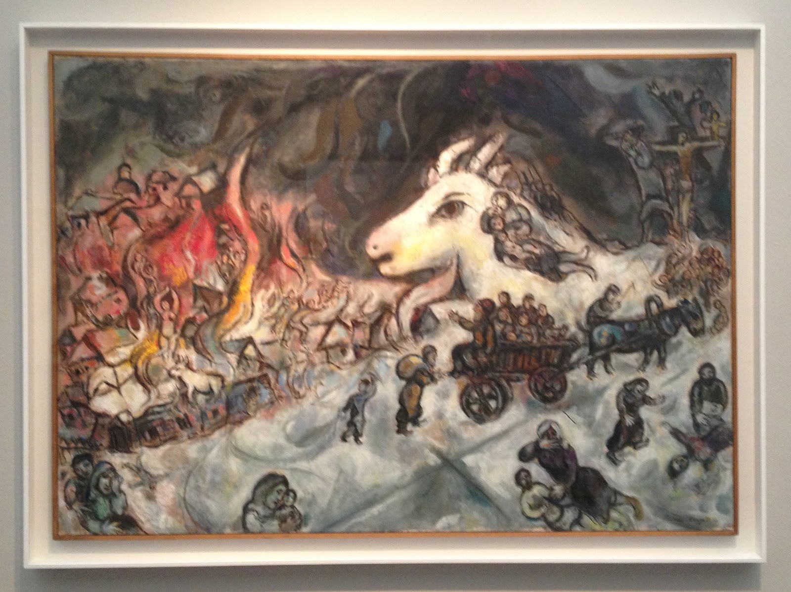
The War 1964-1966

The exhibition focused primarily on the years from 1911 to 1922, a crucial period in Chagall's artistic formation. Over 90 works trace his career in Paris and in is homeland Russia during the period of the revolution. Uniquely among his contemporaries, Chagall developed an art that articulates his Jewish and Russian culture while entering into a dialogue with the visual languages of modern art - from Fauvism to Cubism and Orphism, from Expressionism to Suprematism.

I know I said Chagall was one of my favorite artists when I started at University. But as I was looking at the pieces now I couldn't find the access I used to have to Chagall's poetic, intuitive, almost dreamy pieces of art. Before I found the famous flying cows and violin-playing goats, the floating lovers intriguing and beautiful. Now I found them rather silly, which I know I have no reason for. It all seemed more illustrative, almost childish and the colors seemed to vibrant and intrusive for me.

The Yellow Room 1911

But still, the quality of the works, the selection and the exhibition itself was great and of extraordinary quality. It was also the first time that so many works of different timeperiods of Chagall were united in one room which was a pleasure to see.


Freitag, 1. Februar 2013

Onufri 2012/2013

Hey again, readers.

When I was in Tirana, I was lucky enough to get a chance to see the recurring artshow the National Gallery of Albania (NGA) hosts every year. "Onufri" in its 19th edition was curated by the Italian Daniele Capra under his chosen theme "Perchance to Dream" - a verse from Hamlets famous soliloquy by Shakespeare.

Capra has chosen this title because, according to him, there is a noticeable correspondance between an anguished and confused Hamlet found in a difficult personal circumstance yet, regardless, finds strength to think philosophically about the world and its enigmas. According to Capra the Albanian artists challenge and defy the difficult everyday reality, managing to offer personal solutions.

It was set up like every current artshow. A big open room, white walls and sporadic placement of the artpieces. There were mixed media sculputures, videos, paintings, photographs, drawings... So basically everything you can wish for. The pieces were nice, although I couldn't really find the connection to the theme of the exhibition.

I really liked the photographs by Mariana Kostandini.

"Pa titul"


"Eve"

I didn't really know what to make of them though, and even after contemplating the photographs with the theme of the exhibition in mind I could only come up with this: I think the artist chose to show us how not to use a couch, which could correspond with the theme. It's funny and of course you can apply the "couch-theme" to a bigger scale where the couch could represent something else, like a government, an institution, anything really. But then again, I don't really know and I feel like I'm leaning far out the window here. But besides the difficulty of finding out what they mean, I found the photos aesthetically pleasing and humorous. Great compositions.


Sonntag, 20. Januar 2013

Happy Belated Holidays! Have some turkey!

Hey festive ones,

I wish you all a very belated but still a very merry Christmas, a happy New Year, happy Hanukkah or whatever you choose to celebrate! Oh, and also happy Birthday to my dad who went with me to see what I am about to present to you.

And in the spirit of the holidays (that allready passed a while ago, I know) I think it only makes sense to dedicate this piece of art to those festive times I hope we all were able to enjoy!


We went to see a student art show in Tirana, Albania, and this piece caught my eye immediateley. It's called "Gjeli i arte" which means golden rooster in albanian. And the young artist's name is Flogert Kola and unfortunately I couldn't find any info on this yet unknown artist.

But I thought this piece was brilliant. It's simple, it's well made, it's humoristic and sarcastic. The material is, as you can see, carved styrofoam which is an incredibly cheap material, almost garbage since it's mostly used for packaging and gets thrown away after. So it's ironic that the artist chose to use this material to display something that gets valued so much particularly during the festive season. The main attraction on the dinnertable is the turkey - that's the tradition. But then again by painting it gold, the artist gives it back some value. It may be made of styrofoam but it's golden and therefore important again. And the pairing with the festive red tablecloth gives it an impression of being displayed in a most fancy way, in the most festive way possible. And it also leads me to believe that it is an installation and not just a sculpture.

As I said, great work! And happy belated Holidays again!

Freitag, 31. August 2012

Kolorful. Kute. Kolossal. Koons

Hello,

Jeff Koons at the Fondation Beyeler in Basel. Of course I had to go. And good thing I did. It was an amazing exhibition.

The works by Koons always succeed in rendering the visitor happy and light, entertained and yet feeling the extraordinary quality of the art displayed. As Koons said:

"My work is a support system for people to feel good about themselves."

And it's clear why. The installations are colorful, huge and are very cute, to say the least. Koons' motives are sweet, almost trivial. Little kittens hanging in socks, smiling bears waving at you, piles of cute barnyard animals... you get the idea.


But the most famous pieces by Koons might be the huge Balloonanimal-Installations. From the 100 kilogramm heavy monography I purchased about Koons I learned that he was always fascinated by airfilled objects. The lightness was something that intrigued him and inspired him to create several Balloon-objects in the series "Celebration". The pieces look like huge Balloonfigures modelled by streetclowns but are infact massive stainless steel sculptures, glazed in transparent paint. They seem light as a feather, but in reality they weigh several tons. 


Of course there were other works that fascinated me. Especially one piece caught my eye, it seemed like I had seen it before. It seemed like a baroque mirror, an lavish golden frame but an odd form. There was no clear surface but alot of curves and edges. Then I saw the outlines of a face. I had seen that face before. I read the description in the guide and there it was. The solution. The weirdly shaped golden mirror was actually shaped like Baby-Jesus from a famous Da Vinci Painting (I went to see it in Paris, go check out my post about St. Anne http://www.miumiupow.blogspot.ch/2012/08/african-photographs.html). Marvelous!! Note how the media corresponds with the theme. 


And as you know, I love these kinds of things, where artists quote other pieces of art and use them as inspiration. I find it fascinating!

Apart from the huge installations and sculptures, paintings and collages there were also pieces of Koons' early works in the tradition of the ready-made, introduced by Duchamp in the early 20th century. In the series "The New" Koons displays new, unused vacuum cleaners and shampoo polishers. Here again we detect Koons' fascination with air, airfilled objects and machines., he even calls them "breathing machines". The lifelessness which is bestowed on objects like these dissappears and they appear to have some kind of biological, living quality. 


Koons' equally spectacular and subtle works are repeatedly concerend with themes such as innocence, beauty, sexuality and happiness. These reflect his conception of an art that is accesible to every viewer.


Samstag, 30. Juni 2012

Not the Jeans...


Good Morning,

I think it‘s really important, especially for galeries, that they have an interesting display or poster or some sort of eyecatcher in their windows or doors. If you don‘t notice something special about a place, or don‘t even notice that it‘s a galery, the galery is doing something wrong.
So when I was walking through the city and I noticed these wonderful photographs in the window, I was instantly intrigued. Maybe also because the name next to the photo was a name I knew. 
But it wasn‘t a name I came across in my endeavors in art, but in my other field of study - social anthropology. 
The name Lévi-Strauss, for most people, means a famous brand of jeans-wear. But every anthropologist associates something else with that name. Claude Lévi-Strauss was a famous sociologist and ethnologist in the 20th century, who died recently in 2009 at the age of 101 years. 


In this lifetime he undertook many explorations, mostly to southern America. Brasil was frequently visited by Lévi-Strauss and his associates for research where he also took the photographs which were on display at the „Defacto la Gallery“- Galery. The title of the exposition was „Mondes Perdus“ and it displayed all pictures he took during a reserach trip where he tried to find out, how the technical progress and urbanisation influences and changes the life and agriculture of the indigenous farmers in Brasil. All the pictures were taken by a Leica camera and most of them are portraits of indigenous people living in the rainforest.


The photos were beautiful and very expressive, an effect that was enhanced through the black and white-styled pictures. My dad would have loved the exposition. Simple, expressive photos. 

Freitag, 29. Juni 2012

Saint Anne vs. Mona Lisa

Bonjour mes amis,

During one of my latest visits to the Louvre, I decided to see the exhibition "Saint Anne, Leonardo Da Vinci's ultimate masterpiece".


It was a wonderful expo displaying not only one of the most famous paintings in the world, but also the process of a painter, from the scetch to the finished masterpiece, which is quite unusual.

"The Virgin and Child with Saint Anne" is a large-format painting which was started by Da Vinci in 1501. He kept working on the ambitious masterpiece during his life up to his death in 1519.


The exhibition showed the long and thoughtful process of Da Vinci leading up to the final version. The show combined all known scetches and paintings of the iconographical subject of Saint Anne and her daughter Mary with her grandson, Jesus, by Leonardo.


Not only did the exhibition show the process leading up to the masterpiece, but it also showed how the painting influenced italian art in the 16th century and also more recent artists like Delacroix, Degas or Ernst. They all created new versions of the theme Da Vinci rediscovered. A truly art-historical approach to a painting.

And I got some humor out of the titel of the exposition considering that the Louvre is also homing the "Mona Lisa" by Da Vinci. But the curator funnily chose to name the "Saint Anne" Da Vincis ultimate masterpiece instead of the famous Joconde. Bold. I love it.


Donnerstag, 28. Juni 2012

Marilyns Hand.


Grüezi Readers,
I have to confess, I was prejudiced. I went to the Centre Pompidou again, with visitors, and I dont know if I had a bad day or something, but I didn‘t really enjoy it. I know, I shouldn‘t or people in general shouldn‘t be snobby about art, but on this particular day I walked through the rooms and thought „this is art?“ „I could do that“ „why is this in here“ „this is a waste of space“.... You get the point.
And when I walked to this piece I thought it was a joke. Just random lines and squiggle-squaggles - and that was supposed to be art? I went to the description to find out who‘s responsible for this nonsense. 


And I was amazed!
It wasn‘t just random squigglings but someone, well not someone but Pierre Bismuth, actually had a pretty amazing idea! The artist and cameraman was born in France in 1963 and is also an awardwining screenwriter. This would explain the collaboration of painting and movies in his art.
The work is called „En suivant la main droite - de marilyn monroe dans 'some like it hot‘. And I guess you can imagine now what it is. Bismuth put a tracing paper on his tv-screen and followed for the length of the movie „some like it hot“ the right hand of the actress and icon Marilyn Monroe. What a funny idea.


So instead of calling out and idiot-wannabe-artist I got called out for being ignorant and snobby. Served me well, lesson learned.

Dienstag, 26. Juni 2012

Monumental MONUMENTA 2012

Art-Fans, 

So ever since I saw the beauty that is the Grand Palais at Art Paris, I kept my eyes wide open for more opportunities to visit the grand hall of the Palais. 
I had heard of the yearly Monumenta exhibition before. Since 2007 art-legends like Christian Boltanski or Richard Serra had been invited to create something special for the Grand Palais specifically.
This year Daniel Buren was asked and he accepted. He named his exhibition „Excentrique(s) Travail in situ“. I know, not much comes to mind with this titel, but I wanted to see it anyways. 
I was stunned!! Especially coming into the exhibition through this weird unusual entrance, I was not prepared for the amazingness that was infront of me. You come into this massive space of the Grand Palais through this tiny entrance and the whole room just opens up! And in the vast space Buren created a wonderful installation. On white and black iron pillars there were hundreds of multicolored round transparent foils in different sizes. As visitor you wandered under them, they were just about 3 meters high. It gave an even more asthounding impression of the actual overwhelming size of the Palais. And it also captured another very important feature of the huge hall - the light! 


Buren himself said, that even more beautiful than the Grand Palais and its architecture itself was the light in it. And that is what he intended to point out. He didn‘t want to create something that would not have anything to do with its surroundings but rather something that compliments it. So he decided to keep it quite simple and just find a way to make the people see and think about the hall itself through his installation. 


It definetely worked. As I was walking under the orange, yellow, green and blue transparents, feeling different under every color, all I really thought was how amazing the Grand Palais is. The architecture, the light, the athmosphere... it was wonderful! In the middle of the room were several mirrors on the floor on which you could walk on and see the huge dome of the Palais, which Buren changed a little for the Monumenta. 


And as I walked up on the balcony the view was magnificent aswell. From the balcony you got a view on the installation - before you had just walked under it, feeling like an ant in the grass. Now it seemed like you were seeing a beautiful colored pond with lots and lots of waterlilies. Then you walked down the other side and continued by being an ant again. 


It was truly one of the best exhibitions I ever saw. I managed to see it 4 times and I would have gone more, if I had had the time. Amazing. Well done, Daniel Buren!

Mittwoch, 30. Mai 2012

That's quite Noble.

Hello Readers,

Once again, I would take some time and bring you closer to a rather contemporary artist I've grown fond of. His name is Paul Noble and I've come across his work, which is mainly drawing and sculpture back in Switzerland when I had a seminar about Hollands surrealist scene. Noble participated in an exhibition under a similar titel.

Noble is a british visual artist, born in 1963. He lives and works in London and allready had multiple shows all over the world. He's also represented in some galeries,  including the one here in Paris that I visited to see some of his works.

I was in particular interested in this piece, called "The Egg" for obvious reasons from 2004. It is huge and its pencil on jesmonite, a composite material used in fine arts.


It's covered with small sections which, at first sight appear quite cute, because it's mostly animal doing funny things, wearing funny clothes. Like these squares:


But then you look closer and see that the scenes are actually quite horrible. Like the one above the boxing moles, where a human gets shreddered in a mincer. With every look you see these cute animals doing horrible things to people. But only things, that people also do with/to animals. For example grind them up for meat and food or use them as guides, helpers, slaves... Like the fox using a man as, i guess, a seeing-eye-human. 


Noble touches ground with surrealism, is witty, portrays questions of everyday life and double standards in a funny way, that is also quite shocking if you bother to look twice. 

Dienstag, 29. Mai 2012

My Childhood King

Good evening children and adults,

Due to wonderful weather, the beginning of summer here in Paris, I haven't been as motivated to follow up on my artfancies. It's just too beautiful outside to spend time at the museums...

With that said, there are other possibilities! For example the "Nuit européenne des musées". It is an event that happens in all the major cities in europe, at least the ones cool enough to participate! The big museeums and institutions keep their doors open until at least 23:00 at night - and you can visit them for free!! Plus it's at night, so you don't miss a beautiful sunny, warm, summery day.

Anyways, me and my friends chose a museum, we all hadn't visited before, the Musée des Arts Décoratifs. But mostly we chose it for the current exhibition: "Les histoires de Babar". It was the clear choice, everyone knew who Babar was, eventhough we all grew up on different continents.

So, hooray, we saw a very cute and amazing exhibition about the famous elephant-king in the dashing green suit. I'm sure by now even your memory found the lovely emperor again.


It was fascinating to learn, how the story of Babr and his family evolved and got created in the first place.
One night in 1930, Cécile de Brunhoff, a mother like most, starts telling a story of a small  elephant who has to flee the jungle for the city after a hunter kills his mother. The children of Cécile were so fascinated by the story that they told it to their father, a painter, Jean de Brunhoff - the creator of Babar. The first edition of "Histoire de Babar" was published in 1931.


The exhibition carried alot of the original artwork for the books by Brunhoff, aswell as different letters, notes, sketches and objects of Babar-merchandise. The exhibition also showed how the story of Babar evolved through time, how the royal family grew and how the stories were adapted to new media and a new generation of children. Cartoons and computergames included. There was also a display of the first Babar-stuffed animal and the latest.


The exhibition was so lovely and it made me think back to those days were me and my sister used to cram infront of those colorful books and find out, what Babar and his family and animalfriends were up to now.

Montag, 7. Mai 2012

Let's get musical

Bonjour Mesdames, Messieurs,

Lately I've passed by the Opera of Paris, the Opera Garnier, several times. And the building always impressed me soo much and I always wondered how it must look like from the inside. Of course I know that Chagall painted the ceiling in the grand opera hall and that it must be one of the most beautiful things ever.

So once, I passed by the impressive building again and it just started to rain so I thought "Ok, so I'll check it out." I went in, paid my entryticket and headed to the main entrance. Magnificent. But that's not what I want to tell you about today...

The Opera also has exhibitionspaces and the current exhibition was on "La Belle époque de Massenet".


Jules Massenet was one of the most famous french composers and best known for his operas. During his lifetime (1842-1912) his works were very popular, since melodic music was very much in style. Massenet ranks as one of the greatest melodists of his era. He reached to create an unique combination between art and music, since he wasn't only in charge of the music but everything that needed to be created for an opera. Costumes, sets, scenery etc.

The exhibition tried to give an overview of everything that Massenet had created, an entire new way of how opera was made! Scripts, notes, costumes, jewellery, stages and much more were displayed in a wonderful way! I always like it when alot of differnt things are shown to give you a complete view of a perticular thing. And I'm also alwys blown away by a persons ability to write music. It is a thing that I can not understand but I think it's the most amazing thing when someone can actually imagine and then write down entire operas. Incredible.

Here some pictures of my favorite pieces. As a woman I was of course drawn to the jewels, tiaras, crowns and beautifully embroided costumes. They were truly beautiful!


These are all parts of costumes for operas by Massenet and belong to Inventory of the Bibliotheque-Musée of the Opera Garnier. Especially the last picture, showing the helmet of Bacchus, the mythological god of wine and drunkenness, of the opera with the same name left me standing in awe for a couple of moments. The detail of the carvings and the detail in the form was amazing. Massenets love for melody and harmony isn't only manifested in his musical works, but also in the detail of every other aspect in his operas. And I think the exhibition did a great job displaying that. I loved it, and I love Massenets music!

Donnerstag, 3. Mai 2012

Come very close!

Oh hey there you are,

I just want to tell you about an artist I discovered for myself real quick. His name is Oscar Camilo de las Flores and he is a mexican artist born in 1974.

I saw his works in the Collection of the Museum Boijmans Van Beuningen which is on tour right now with their contemporary surrealistic drawings.

There were four independent works that made a series. They were drawn on paper with a regular pen and ink. The works range from 2008 to 2009.

So first of all here is how it looks from far away:


Then like this:


And now some details:


Obviously I took details of comics - because I love comics. But you can really see the skill and time the artist used to create these works. The detail, the finesse and the style is just incredible. You can really see the surrealistic tendencies since your automatic imagination gets triggered the moment you look at the drawings of de la Flores. The themes are linked to the history of his country, art history and modern societies problems. It's very dark and grottesque which fits perfectly to the trend of art right now whilst the works are in the surrealist tradition. Very interesting, this artist.

Dienstag, 1. Mai 2012

Flemish.

Hey there,

So after all this modern art, I thought I needed some more accesable art. And by that I mean paintings. Paintings are probably my favorite medium of art, since they are the most traditional.

So I've heard about this small exhibition about flemish art at the Institut  Néerlandais, the Netherland's Cultural Institution in Paris. It was called "Un Univers intime. Tableaux de la Collection Frits Lugt" and it was A-MAZING!! First of all it was the perfect sized exhibition so you could totally enjoy and take all of it in. Second it was kind of a secret tip, so there weren't as many people. Very pleasant. Third - the space was absolutely beautiful and put to good use. And then, fourth, I have never seen an exhibition guide be so good. Seriously, it was one of the best organized, planed, executed and best explained exhibition I ever had the pleasure of visiting! Plus I really enjoy that era of painting so that was a bonus aswell. Frits Lugt mostly collected flemish and dutch paintings and artists of the golden age and gives a wonderful overview of painting in that time and area.


One painting that especially caught my eye was a tableau "Festoons, Masks and Rosettes of Shells" by a so far unknown artist to me, Jan van Kessel Senior in 1656. It a very peculiar display of alot of differnet kinds and types of seashells. The shells in the picture are arranged so they build different kinds of festoons, masks and rosettes. It is the only known work that represents so many different kinds of decorative and anthropomorphe assemblies of shells at that time. You have to imagine, that at that time it was not easy to have a full knowledge of different kinds of domestic and exotic shells. The artist probably had to collect and find and make sketches of shells for a long time to aquire such an extensive collection of shells. It made me be amazed and giggle at the same time! 


Of course there were alot of traditional flemish landscapes and peasant-life themed paintings and also some portraits. But the oeuvre by Kessel Senior was my favorite one.

Montag, 30. April 2012

Centre Pompidou, don't mind if I do

Bonsoir mes amis de l'art,

So, another big one is coming up. One of the most important collections of contemporary art in the world: The Centre Pompidou. Of course I visited it before, but now I'm actually gonna tell you, what pieces I love slash like.

So there is one quite eyestopping work by Piotr Kowalski. The piece is called "Identité No. 2" and was created in 1973. And as you can tell by the trend of light and neon right now, it is a true inovative piece. I mean, it was created 40 years ago - crazy, right?!


It's basically just three different sized cubes made out of lighting tubes infront of mirrors. Maybe the name comes from there. Their second identity is in the mirror or comes through the mirror. But one thing you can't tell by looking at the pictures is the sound it makes. Yes, you would have never guessed, right? There is a really strong buzzing and humming noise. It almost sounds like a really busy meadow in summer creawling with different insects. 

Another piece I think is brilliant is an installation by Jean Dubuffet and is called "Le jardin d'hiver". The first thing that came to mind is the saying that art can be a refuge. This piece is an actual refuge:


It's an interactive walk-in work! I felt like I was walking inside a comic because of the strong black lines and the black and white color. It felt totally safe and wonderful and it also brings out the childish side in you. Because who didn't build caves out of their blankets and chairs. At the same time it felt a little lonely and dark, because there is no source of light, exept the entrance which can be closed and because of the material which makes every step you take sound hollow and echo. 

There's always new stuff to discover at Pompidou, I think I'll be telling you about more of my favorites some other time though.

Sonntag, 29. April 2012

Marc Fornes times three

Heya fans of culture,


I‘ve come across this one artist several times now! 
Marc Fornes is actually an architect which you can almost guess by his insane pieces.
He does installations, mostly in metal or aluminium, that look like crazy computerized actual real shapes or very modern corrals. Well, at least that is my opinion. He is a genius in engineering as you can clearly tell by the way his pieces are constructed. 

I saw the first piece by him as I was walking through the streets of Paris through the window of Inception Gallery.
Then again, I came across a wonderful black and white piece by him at Art Paris 2012 and  I even got photographed infront of it, because my outfit matched. And then, finally I found an installation by him at Centre Pompidou which finally gave me the push I needed to do some research. Because every time I was very intrigued and amazed by the engenius construction!
Fornes himself describes his works and process in these specific terms:
”Explicit and Encoded”, “Precise Indetermination”, “Progressive Geometry” all seeking “Unconventional Futures”.
It seems like his constructions are huge 3D optical illusions, since they are mostly just in two or three colors and very fluent and organic in shape. Which is of course in contrast with the very sturdy and strong materials and the studded construction. 


You can't really tell with these pictures, but the pieces are huge!!