Posts mit dem Label Art History werden angezeigt. Alle Posts anzeigen

Freitag, 5. April 2013

Spanish Impressionism

Welcome once again,

This time, my way lead me to Valencia, Spain. I went to visit a friend and of course as part of my mandatory city discovering program several museums were on my plan. My first stop was the Museum of Fine Arts of Valencia. Beautiful, beautiful building by the way!

Apart from the permanent collections, there was a wing solely dedicated to a Valencia-born artist. Joaquin Sorolla y Bastida (1863-1923) exelled at painting portraits, landscapes and works of social and historic themes. The exhibition showed a wonderful selection of some portraits he painted, but also some social themes. He painted in an impressionistic way, very expressive and bold, with vibrant colors. This one, painted in 1900 of Count Artal, made me stand infront of that portriat for a very long time, which rarely happens, since portrait is not my favorite medium of painting.


I love how the picture is divided into different sections by the various lines and diagonals throughout. I love the format, I love the vivid, yet rather undefined background, i love the placement of the portrayed. Beautiful picture.

But another picture I couldn't take my eyes off, was "People in frock coats playing in a garden" which Sorolla completed in 1900.


Isn't it just breathtaking?? I have rarely seen an impressionist painting with so much life in it. The colors are so rich and lush, not only in the depicted nature but also on the people and their costumes. Incredible how Sorolla captured the early autumn sunlight shining through the tall trees and falling on the playful scene. It seems like you can almost smell the freshness of the leaves, the crispness of the air this scene takes place in. What you can't see here, is the format. The picture is actually really huge so it seems, like you're standing right infront of that scene, participating almost in the joyful play. And look at that detail!! 


A true masterpiece!!

Freitag, 8. März 2013

Not ever ForgITTEN again

Fans of color, hello!

Tonight I had the opportunity to visit the exhibition "Itten and Klee" in the Kunstmuseum in Bern, guided by one of the curators herself, Monika Schäfer. 

I have to admit, I hadn't done any research beforehand and I had never heard about "Itten" before so I didn't know what to expect. Is "Itten" a place? A theory or idea? Or is it maybe another person? Pretty soon, almost immediateley it was clear to me, that "Itten" was also an artist of the same era as Paul Klee (1879-1940). Johannes Itten (1888-1967) is also, like Klee, a swiss artist from the 20th century. Not having heard from him before shamed me a little since his works, as I learned, are quite extraordinary. 

The theme of the exhibition was color itself. The cosmos of color to be exact. Both artists spent an enormous amount of time studying colors. Several rooms of the exhibition were just dedicated to show their theoretical approach on color. They both were groundbreaking in our modern understanding of color, colorschemes, colorinteraction etc. And both artists worked their findings on color and their experiments into their works. In a very systematic, almost mathematical way.

The great thing about getting led through an exhibition by someone who created it, is that you get to hear alot of anecdotes. For example one about this piece "Encounter" from 1916 by Johannes Itten. It seems quite systematic, clear composition, colorful. Eventhough you can't see an actual object or something in perticular there is a rather sad backstory. A close personal friend of Itten had taken her life, shortly before this work originated. The greyish spiral that represents the tragic loss meets the more lively and colorful spiral in an intertwined "Encounter". This piece represents a great deal of pain on the artist's part. 

Since I haven't really encountered Itten before, I will focus on another series of works by him, which I thought was enchanting. "Spring", "Summer", "Autumn" and "Winter" are four works of a series from a private collector that were created in 1963. You can again see the focus on the demonstration of colors and how they work together. Itten, more than Klee, also tried to apply the study of colors to other fields of sciences or areas of different focuses. For example he tried to categorize different signs in colors, or feelings and even traits of character. This series although represents his application of color to the different seasons of the year which in my opinion he managed to achieve beautifully. 


Dienstag, 5. März 2013

Checking out Chagall

Hi again there,

So there is a pretty big and as it seems important Marc Chagall exhibition at the Kunsthaus in Zurich. As you can imagine I was one of the first ones there. When I began my studies in art Chagall was my of my favorite expressionist painters. The colors and the melancholic tone of his pieces were always something that spoke to me. So naturally I was full of anticipation.

The exhibition was beautifully arranged, as the Kunsthaus always manages to achieve with its shows. The selection of paintings was broad and as I learned it took over two years for the curatorial team to aquire the works, coming from all over the world, from private collections, museums and galleries.

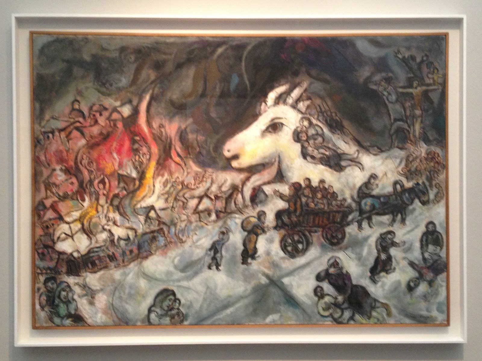
The War 1964-1966

The exhibition focused primarily on the years from 1911 to 1922, a crucial period in Chagall's artistic formation. Over 90 works trace his career in Paris and in is homeland Russia during the period of the revolution. Uniquely among his contemporaries, Chagall developed an art that articulates his Jewish and Russian culture while entering into a dialogue with the visual languages of modern art - from Fauvism to Cubism and Orphism, from Expressionism to Suprematism.

I know I said Chagall was one of my favorite artists when I started at University. But as I was looking at the pieces now I couldn't find the access I used to have to Chagall's poetic, intuitive, almost dreamy pieces of art. Before I found the famous flying cows and violin-playing goats, the floating lovers intriguing and beautiful. Now I found them rather silly, which I know I have no reason for. It all seemed more illustrative, almost childish and the colors seemed to vibrant and intrusive for me.

The Yellow Room 1911

But still, the quality of the works, the selection and the exhibition itself was great and of extraordinary quality. It was also the first time that so many works of different timeperiods of Chagall were united in one room which was a pleasure to see.


Donnerstag, 7. Februar 2013

The Picture in the Picture.

Good evening to you,

So, this is something I always love to see. When we went to the National Gallery of Art in Tirana we were browsing through the paintings and sculptures, most of them with a socialist and communist theme.

One painting although caught my eye. And it wasn't because I thought it was espeacially beautiful, but something about it seemed familiar. Then I saw what it was. In the first room I had allready seen a picture which was now included in the picture I was now looking at.


So this is the painting I was looking at. "Në studio" which means in the studio was created 1979 by Vilson Kilica, an Albanian painter. He was also the first director of the Academy of Arts in Tirana, the capital of Albania, in 1966. So, back to my discovery. Here you see a painting which shows us the studio of a painter, who is also shown here, most probably Kilica himself. He is working on a piece and there are numerous other paintings hanging on the wall. There is also another man in the painting who takes up most of the space but that wasn't what I saw first. My eye immediately went to the landscape painting in the middle of the picture. The first of the three.


It seemed familar and indeed it was. 20 minutes earlier I had seen that exact painting in another wing of the museum.


It's a painting by Vangjush Mio (1891-1957), named "Sigeni i Pogradecit" which means the lake of Progradec. Mio is one of the most known Albanian artists and he is also known as the first impressionist painter of Albania. And indeed there are lots of parallels to the famous impressionists like Monet and Cezanne. The theme of the landscape, the light, dusty coloration, the characteristic style. 

So, this painting, now at the Gallery here in Tirana, was most probably in the studio of Kilica. Of course the frame changed, but it is the same picture here as it is in the painting. Isn't that great? The artist as a collector - love it!

Freitag, 1. Februar 2013

Onufri 2012/2013

Hey again, readers.

When I was in Tirana, I was lucky enough to get a chance to see the recurring artshow the National Gallery of Albania (NGA) hosts every year. "Onufri" in its 19th edition was curated by the Italian Daniele Capra under his chosen theme "Perchance to Dream" - a verse from Hamlets famous soliloquy by Shakespeare.

Capra has chosen this title because, according to him, there is a noticeable correspondance between an anguished and confused Hamlet found in a difficult personal circumstance yet, regardless, finds strength to think philosophically about the world and its enigmas. According to Capra the Albanian artists challenge and defy the difficult everyday reality, managing to offer personal solutions.

It was set up like every current artshow. A big open room, white walls and sporadic placement of the artpieces. There were mixed media sculputures, videos, paintings, photographs, drawings... So basically everything you can wish for. The pieces were nice, although I couldn't really find the connection to the theme of the exhibition.

I really liked the photographs by Mariana Kostandini.

"Pa titul"


"Eve"

I didn't really know what to make of them though, and even after contemplating the photographs with the theme of the exhibition in mind I could only come up with this: I think the artist chose to show us how not to use a couch, which could correspond with the theme. It's funny and of course you can apply the "couch-theme" to a bigger scale where the couch could represent something else, like a government, an institution, anything really. But then again, I don't really know and I feel like I'm leaning far out the window here. But besides the difficulty of finding out what they mean, I found the photos aesthetically pleasing and humorous. Great compositions.


Mittwoch, 29. August 2012

National Gallery of Zimbabwe in Bulawayo

Hello dear ones,

I did allready talk about Bulawayo, an artist from there and the National Gallery in Bulawayo. But I never took the time to actually talk about the building the museum is housed in.


It is one of the oldest original buildings still used in Bulawayo. It is called the Douslin House after its architect William Douslin.

After water and electricity became available in Bulawayo on June 1898 and the railway reached the city in 1897 an economical boom occured. Spaces for shops and offices were needed. The Douslin House, formerly known as the Willoughby's Building was finished in 1901 and then opened for business. The Bulawayo Art Gallery purchased the building in September 1980 when the museum officially opened. The history of the building is documented extraordinarily well through original plans, letters from involved people like landlords, architects and funders aswell through local newspapers like the Bulawayo Chronicle.

But now to the building itself. The imposing principal entrance to the building is in Main Street. There is a portico decorated with beautiful moulded cornices, pillars, an impressive pressed metal ceiling. The front doors have elaborate brass fingerplates. The entrance hall is similarly decorated. There, a magnificent staircase gives way to the first floor. The newel and banisters posts are of Burma teak and walnut, with the newel posts being beautifully carved. 


The skirting throughout the building is of generous proportions and the offices also have decorative moulded cornices. The doors are said to be of Burma teak. The handles are brass with brass fingerplates.


Like the National Gallery in Harare the Gallery in Bulawayo is a state institution. All the actions, events and exhibitions must be approved by the state which can sometimes lead to conflict. When I visited the Gallery the current exhibition was closed down, since it didn't agree with the "rules" of the state. I guess it was critical to the current state of the country or portrayed political issues very harshly. I can't tell, I didn't see it. I could only sneak a peak and id did seems pretty violent, mostly because of the red and black colors and the red walls. 


But the National Gallery in Bulawayo is an outstanding institution, no doubt about it. Here its statement released from the management:

"At the National Gallery in Bulawayo, we are tasked with the creative and intellectual discipline to select, to nurture and commend outstanding works of visual art, to select and display pivotal works, to generate and improve upon existing talent, to train and develop artistic skills, to educate, to empower, to mediate, and mostly to celebrate."


Freitag, 29. Juni 2012

Saint Anne vs. Mona Lisa

Bonjour mes amis,

During one of my latest visits to the Louvre, I decided to see the exhibition "Saint Anne, Leonardo Da Vinci's ultimate masterpiece".


It was a wonderful expo displaying not only one of the most famous paintings in the world, but also the process of a painter, from the scetch to the finished masterpiece, which is quite unusual.

"The Virgin and Child with Saint Anne" is a large-format painting which was started by Da Vinci in 1501. He kept working on the ambitious masterpiece during his life up to his death in 1519.


The exhibition showed the long and thoughtful process of Da Vinci leading up to the final version. The show combined all known scetches and paintings of the iconographical subject of Saint Anne and her daughter Mary with her grandson, Jesus, by Leonardo.


Not only did the exhibition show the process leading up to the masterpiece, but it also showed how the painting influenced italian art in the 16th century and also more recent artists like Delacroix, Degas or Ernst. They all created new versions of the theme Da Vinci rediscovered. A truly art-historical approach to a painting.

And I got some humor out of the titel of the exposition considering that the Louvre is also homing the "Mona Lisa" by Da Vinci. But the curator funnily chose to name the "Saint Anne" Da Vincis ultimate masterpiece instead of the famous Joconde. Bold. I love it.


Dienstag, 26. Juni 2012

Monumental MONUMENTA 2012

Art-Fans, 

So ever since I saw the beauty that is the Grand Palais at Art Paris, I kept my eyes wide open for more opportunities to visit the grand hall of the Palais. 
I had heard of the yearly Monumenta exhibition before. Since 2007 art-legends like Christian Boltanski or Richard Serra had been invited to create something special for the Grand Palais specifically.
This year Daniel Buren was asked and he accepted. He named his exhibition „Excentrique(s) Travail in situ“. I know, not much comes to mind with this titel, but I wanted to see it anyways. 
I was stunned!! Especially coming into the exhibition through this weird unusual entrance, I was not prepared for the amazingness that was infront of me. You come into this massive space of the Grand Palais through this tiny entrance and the whole room just opens up! And in the vast space Buren created a wonderful installation. On white and black iron pillars there were hundreds of multicolored round transparent foils in different sizes. As visitor you wandered under them, they were just about 3 meters high. It gave an even more asthounding impression of the actual overwhelming size of the Palais. And it also captured another very important feature of the huge hall - the light! 


Buren himself said, that even more beautiful than the Grand Palais and its architecture itself was the light in it. And that is what he intended to point out. He didn‘t want to create something that would not have anything to do with its surroundings but rather something that compliments it. So he decided to keep it quite simple and just find a way to make the people see and think about the hall itself through his installation. 


It definetely worked. As I was walking under the orange, yellow, green and blue transparents, feeling different under every color, all I really thought was how amazing the Grand Palais is. The architecture, the light, the athmosphere... it was wonderful! In the middle of the room were several mirrors on the floor on which you could walk on and see the huge dome of the Palais, which Buren changed a little for the Monumenta. 


And as I walked up on the balcony the view was magnificent aswell. From the balcony you got a view on the installation - before you had just walked under it, feeling like an ant in the grass. Now it seemed like you were seeing a beautiful colored pond with lots and lots of waterlilies. Then you walked down the other side and continued by being an ant again. 


It was truly one of the best exhibitions I ever saw. I managed to see it 4 times and I would have gone more, if I had had the time. Amazing. Well done, Daniel Buren!

Montag, 14. Mai 2012

For the mothers

Dear mothers,

Since it was Mothersday yesterday, I thought I'd do a post about a picture of one of the most famous mothers in art: Anna Whistler. Or better known as James Abbott McNeill Whistlers Mother or "Arrangement in Grey and Black No.1" from 1871. It also hangs in the Musée d'Orsay at the moment as is one of my favorites!


This very atypical portrait was actually created almost by mistake. From letters we know, that the original model who Whistler was supposed to paint that day failed to show up. Whistler then suggested that he'd paint his mother. But because of her old age she failed to take the originally intended standing pose and Whistler painted her sitting and in profile. A lucky change of events! The "Arrangement in Grey and Black No.1" is the most famous painting by this otherwise less known american painter and founder of Tonalism.

(Tonalism describes an artistic style that emerged in the 1880s in the US where the artists painted landscapes in one overall toned athmosphere and mist)

Ok, so this is the famous mother I thought of, but I also enjoy very much the oncoming summer and warm weather and overall colorfulness and playfullness of the current season, which isn't very well represented in this painting - as it is called "Arrangement in Grey and Black". So when I checked on one of my happy-feeling-artists i found this:


My favorite Balloon-Artist Larry Moss did a replica of the original - but with balloons!! This is way more in the spirit of how i'm feeling these days. All happy! But no, seriously, Larry Moss started out as a streetartist in New York and is obviously amazing and he recreates famous paintings in art history with balloons. He's great if you want to check him out! He doesn't only do art-replicas but also alot of different balloon-art and -objects. Yay!

And I also want to mention my own mom, who is wonderful, lovely and amazing and should also have her own portrait made into balloonart! Happy Mothersday!