Posts mit dem Label Kunst werden angezeigt. Alle Posts anzeigen

Freitag, 8. März 2013

Not ever ForgITTEN again

Fans of color, hello!

Tonight I had the opportunity to visit the exhibition "Itten and Klee" in the Kunstmuseum in Bern, guided by one of the curators herself, Monika Schäfer. 

I have to admit, I hadn't done any research beforehand and I had never heard about "Itten" before so I didn't know what to expect. Is "Itten" a place? A theory or idea? Or is it maybe another person? Pretty soon, almost immediateley it was clear to me, that "Itten" was also an artist of the same era as Paul Klee (1879-1940). Johannes Itten (1888-1967) is also, like Klee, a swiss artist from the 20th century. Not having heard from him before shamed me a little since his works, as I learned, are quite extraordinary. 

The theme of the exhibition was color itself. The cosmos of color to be exact. Both artists spent an enormous amount of time studying colors. Several rooms of the exhibition were just dedicated to show their theoretical approach on color. They both were groundbreaking in our modern understanding of color, colorschemes, colorinteraction etc. And both artists worked their findings on color and their experiments into their works. In a very systematic, almost mathematical way.

The great thing about getting led through an exhibition by someone who created it, is that you get to hear alot of anecdotes. For example one about this piece "Encounter" from 1916 by Johannes Itten. It seems quite systematic, clear composition, colorful. Eventhough you can't see an actual object or something in perticular there is a rather sad backstory. A close personal friend of Itten had taken her life, shortly before this work originated. The greyish spiral that represents the tragic loss meets the more lively and colorful spiral in an intertwined "Encounter". This piece represents a great deal of pain on the artist's part. 

Since I haven't really encountered Itten before, I will focus on another series of works by him, which I thought was enchanting. "Spring", "Summer", "Autumn" and "Winter" are four works of a series from a private collector that were created in 1963. You can again see the focus on the demonstration of colors and how they work together. Itten, more than Klee, also tried to apply the study of colors to other fields of sciences or areas of different focuses. For example he tried to categorize different signs in colors, or feelings and even traits of character. This series although represents his application of color to the different seasons of the year which in my opinion he managed to achieve beautifully. 


Dienstag, 5. März 2013

Checking out Chagall

Hi again there,

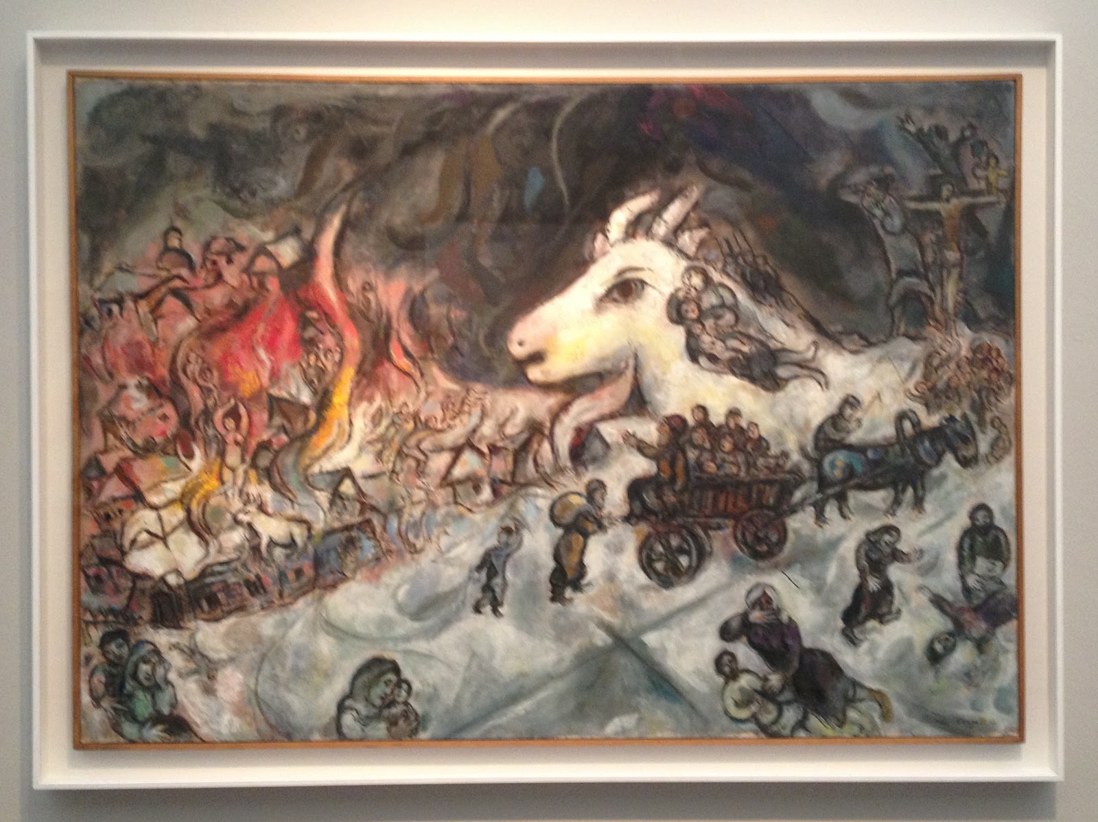
So there is a pretty big and as it seems important Marc Chagall exhibition at the Kunsthaus in Zurich. As you can imagine I was one of the first ones there. When I began my studies in art Chagall was my of my favorite expressionist painters. The colors and the melancholic tone of his pieces were always something that spoke to me. So naturally I was full of anticipation.

The exhibition was beautifully arranged, as the Kunsthaus always manages to achieve with its shows. The selection of paintings was broad and as I learned it took over two years for the curatorial team to aquire the works, coming from all over the world, from private collections, museums and galleries.

The War 1964-1966

The exhibition focused primarily on the years from 1911 to 1922, a crucial period in Chagall's artistic formation. Over 90 works trace his career in Paris and in is homeland Russia during the period of the revolution. Uniquely among his contemporaries, Chagall developed an art that articulates his Jewish and Russian culture while entering into a dialogue with the visual languages of modern art - from Fauvism to Cubism and Orphism, from Expressionism to Suprematism.

I know I said Chagall was one of my favorite artists when I started at University. But as I was looking at the pieces now I couldn't find the access I used to have to Chagall's poetic, intuitive, almost dreamy pieces of art. Before I found the famous flying cows and violin-playing goats, the floating lovers intriguing and beautiful. Now I found them rather silly, which I know I have no reason for. It all seemed more illustrative, almost childish and the colors seemed to vibrant and intrusive for me.

The Yellow Room 1911

But still, the quality of the works, the selection and the exhibition itself was great and of extraordinary quality. It was also the first time that so many works of different timeperiods of Chagall were united in one room which was a pleasure to see.


Donnerstag, 7. Februar 2013

The Picture in the Picture.

Good evening to you,

So, this is something I always love to see. When we went to the National Gallery of Art in Tirana we were browsing through the paintings and sculptures, most of them with a socialist and communist theme.

One painting although caught my eye. And it wasn't because I thought it was espeacially beautiful, but something about it seemed familiar. Then I saw what it was. In the first room I had allready seen a picture which was now included in the picture I was now looking at.


So this is the painting I was looking at. "Në studio" which means in the studio was created 1979 by Vilson Kilica, an Albanian painter. He was also the first director of the Academy of Arts in Tirana, the capital of Albania, in 1966. So, back to my discovery. Here you see a painting which shows us the studio of a painter, who is also shown here, most probably Kilica himself. He is working on a piece and there are numerous other paintings hanging on the wall. There is also another man in the painting who takes up most of the space but that wasn't what I saw first. My eye immediately went to the landscape painting in the middle of the picture. The first of the three.


It seemed familar and indeed it was. 20 minutes earlier I had seen that exact painting in another wing of the museum.


It's a painting by Vangjush Mio (1891-1957), named "Sigeni i Pogradecit" which means the lake of Progradec. Mio is one of the most known Albanian artists and he is also known as the first impressionist painter of Albania. And indeed there are lots of parallels to the famous impressionists like Monet and Cezanne. The theme of the landscape, the light, dusty coloration, the characteristic style. 

So, this painting, now at the Gallery here in Tirana, was most probably in the studio of Kilica. Of course the frame changed, but it is the same picture here as it is in the painting. Isn't that great? The artist as a collector - love it!

Freitag, 1. Februar 2013

Onufri 2012/2013

Hey again, readers.

When I was in Tirana, I was lucky enough to get a chance to see the recurring artshow the National Gallery of Albania (NGA) hosts every year. "Onufri" in its 19th edition was curated by the Italian Daniele Capra under his chosen theme "Perchance to Dream" - a verse from Hamlets famous soliloquy by Shakespeare.

Capra has chosen this title because, according to him, there is a noticeable correspondance between an anguished and confused Hamlet found in a difficult personal circumstance yet, regardless, finds strength to think philosophically about the world and its enigmas. According to Capra the Albanian artists challenge and defy the difficult everyday reality, managing to offer personal solutions.

It was set up like every current artshow. A big open room, white walls and sporadic placement of the artpieces. There were mixed media sculputures, videos, paintings, photographs, drawings... So basically everything you can wish for. The pieces were nice, although I couldn't really find the connection to the theme of the exhibition.

I really liked the photographs by Mariana Kostandini.

"Pa titul"


"Eve"

I didn't really know what to make of them though, and even after contemplating the photographs with the theme of the exhibition in mind I could only come up with this: I think the artist chose to show us how not to use a couch, which could correspond with the theme. It's funny and of course you can apply the "couch-theme" to a bigger scale where the couch could represent something else, like a government, an institution, anything really. But then again, I don't really know and I feel like I'm leaning far out the window here. But besides the difficulty of finding out what they mean, I found the photos aesthetically pleasing and humorous. Great compositions.


Sonntag, 20. Januar 2013

Happy Belated Holidays! Have some turkey!

Hey festive ones,

I wish you all a very belated but still a very merry Christmas, a happy New Year, happy Hanukkah or whatever you choose to celebrate! Oh, and also happy Birthday to my dad who went with me to see what I am about to present to you.

And in the spirit of the holidays (that allready passed a while ago, I know) I think it only makes sense to dedicate this piece of art to those festive times I hope we all were able to enjoy!


We went to see a student art show in Tirana, Albania, and this piece caught my eye immediateley. It's called "Gjeli i arte" which means golden rooster in albanian. And the young artist's name is Flogert Kola and unfortunately I couldn't find any info on this yet unknown artist.

But I thought this piece was brilliant. It's simple, it's well made, it's humoristic and sarcastic. The material is, as you can see, carved styrofoam which is an incredibly cheap material, almost garbage since it's mostly used for packaging and gets thrown away after. So it's ironic that the artist chose to use this material to display something that gets valued so much particularly during the festive season. The main attraction on the dinnertable is the turkey - that's the tradition. But then again by painting it gold, the artist gives it back some value. It may be made of styrofoam but it's golden and therefore important again. And the pairing with the festive red tablecloth gives it an impression of being displayed in a most fancy way, in the most festive way possible. And it also leads me to believe that it is an installation and not just a sculpture.

As I said, great work! And happy belated Holidays again!

Mittwoch, 7. November 2012

Tiles

How are you, dear reader?

This might be a rather unusual post, but nonetheless I really wanted to share this with you.

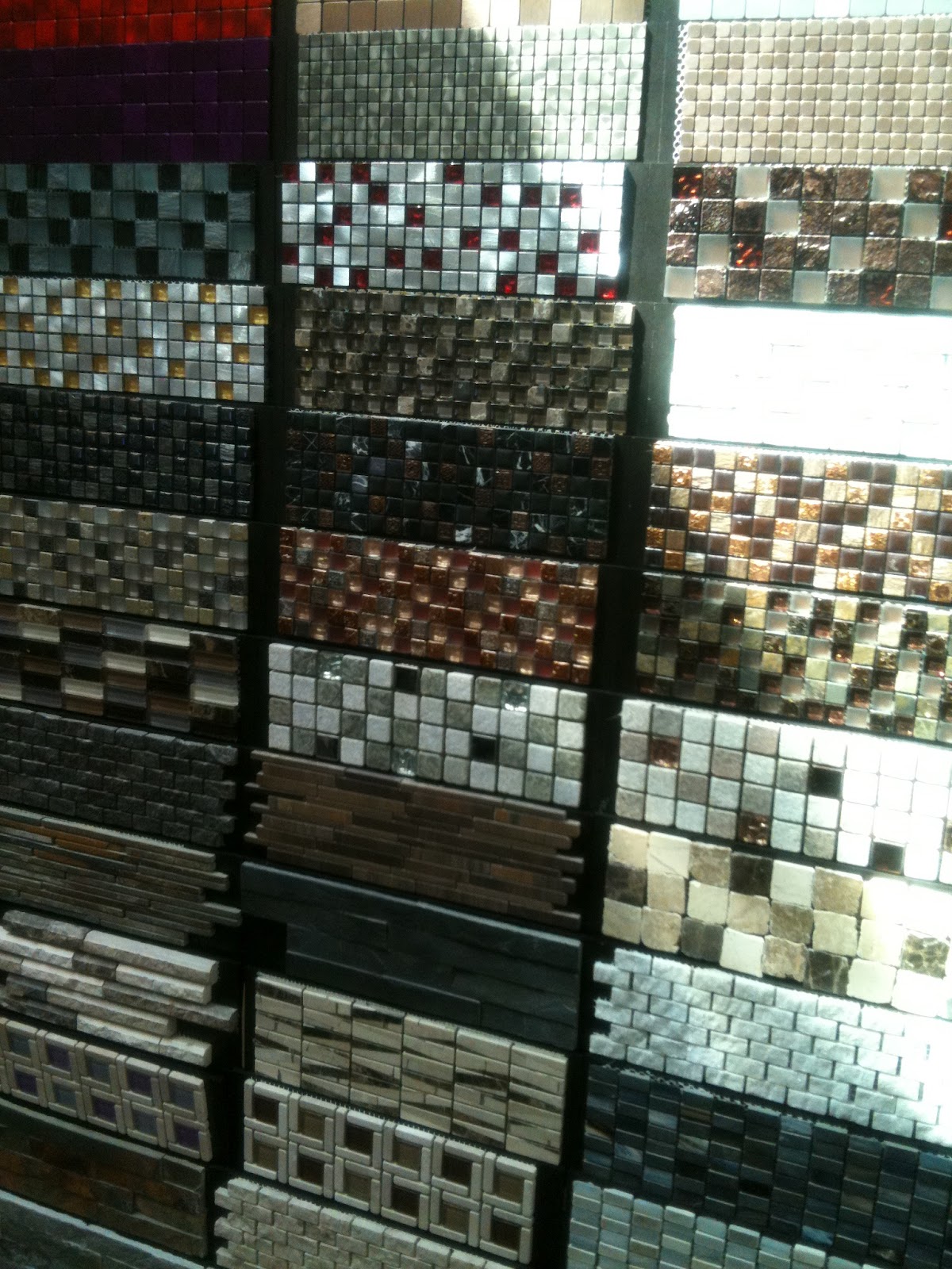
A couple of weeks ago I went to an exhibition. Wow, really? Yes. But it was not your usual art expo. No, it was a tile exhibition. I know, this breaks with the regular scheme of artreviews but it was an actual exhibition and to be honest, it was very interesting.

There were regular tiles, big tiles, huge tiles, tiny tiles, colorful tiles, ornamented tiles. So there were alot of differnet shapes, colors, materials and they were displayed like little pieces of art. So I wanted to give them the honor of not just being simple tiles for once, but to be viewed as little pieces of art.


Freitag, 31. August 2012

Kolorful. Kute. Kolossal. Koons

Hello,

Jeff Koons at the Fondation Beyeler in Basel. Of course I had to go. And good thing I did. It was an amazing exhibition.

The works by Koons always succeed in rendering the visitor happy and light, entertained and yet feeling the extraordinary quality of the art displayed. As Koons said:

"My work is a support system for people to feel good about themselves."

And it's clear why. The installations are colorful, huge and are very cute, to say the least. Koons' motives are sweet, almost trivial. Little kittens hanging in socks, smiling bears waving at you, piles of cute barnyard animals... you get the idea.


But the most famous pieces by Koons might be the huge Balloonanimal-Installations. From the 100 kilogramm heavy monography I purchased about Koons I learned that he was always fascinated by airfilled objects. The lightness was something that intrigued him and inspired him to create several Balloon-objects in the series "Celebration". The pieces look like huge Balloonfigures modelled by streetclowns but are infact massive stainless steel sculptures, glazed in transparent paint. They seem light as a feather, but in reality they weigh several tons. 


Of course there were other works that fascinated me. Especially one piece caught my eye, it seemed like I had seen it before. It seemed like a baroque mirror, an lavish golden frame but an odd form. There was no clear surface but alot of curves and edges. Then I saw the outlines of a face. I had seen that face before. I read the description in the guide and there it was. The solution. The weirdly shaped golden mirror was actually shaped like Baby-Jesus from a famous Da Vinci Painting (I went to see it in Paris, go check out my post about St. Anne http://www.miumiupow.blogspot.ch/2012/08/african-photographs.html). Marvelous!! Note how the media corresponds with the theme. 


And as you know, I love these kinds of things, where artists quote other pieces of art and use them as inspiration. I find it fascinating!

Apart from the huge installations and sculptures, paintings and collages there were also pieces of Koons' early works in the tradition of the ready-made, introduced by Duchamp in the early 20th century. In the series "The New" Koons displays new, unused vacuum cleaners and shampoo polishers. Here again we detect Koons' fascination with air, airfilled objects and machines., he even calls them "breathing machines". The lifelessness which is bestowed on objects like these dissappears and they appear to have some kind of biological, living quality. 


Koons' equally spectacular and subtle works are repeatedly concerend with themes such as innocence, beauty, sexuality and happiness. These reflect his conception of an art that is accesible to every viewer.


Mittwoch, 29. August 2012

National Gallery of Zimbabwe in Bulawayo

Hello dear ones,

I did allready talk about Bulawayo, an artist from there and the National Gallery in Bulawayo. But I never took the time to actually talk about the building the museum is housed in.


It is one of the oldest original buildings still used in Bulawayo. It is called the Douslin House after its architect William Douslin.

After water and electricity became available in Bulawayo on June 1898 and the railway reached the city in 1897 an economical boom occured. Spaces for shops and offices were needed. The Douslin House, formerly known as the Willoughby's Building was finished in 1901 and then opened for business. The Bulawayo Art Gallery purchased the building in September 1980 when the museum officially opened. The history of the building is documented extraordinarily well through original plans, letters from involved people like landlords, architects and funders aswell through local newspapers like the Bulawayo Chronicle.

But now to the building itself. The imposing principal entrance to the building is in Main Street. There is a portico decorated with beautiful moulded cornices, pillars, an impressive pressed metal ceiling. The front doors have elaborate brass fingerplates. The entrance hall is similarly decorated. There, a magnificent staircase gives way to the first floor. The newel and banisters posts are of Burma teak and walnut, with the newel posts being beautifully carved. 


The skirting throughout the building is of generous proportions and the offices also have decorative moulded cornices. The doors are said to be of Burma teak. The handles are brass with brass fingerplates.


Like the National Gallery in Harare the Gallery in Bulawayo is a state institution. All the actions, events and exhibitions must be approved by the state which can sometimes lead to conflict. When I visited the Gallery the current exhibition was closed down, since it didn't agree with the "rules" of the state. I guess it was critical to the current state of the country or portrayed political issues very harshly. I can't tell, I didn't see it. I could only sneak a peak and id did seems pretty violent, mostly because of the red and black colors and the red walls. 

But the National Gallery in Bulawayo is an outstanding institution, no doubt about it. Here its statement released from the management:

"At the National Gallery in Bulawayo, we are tasked with the creative and intellectual discipline to select, to nurture and commend outstanding works of visual art, to select and display pivotal works, to generate and improve upon existing talent, to train and develop artistic skills, to educate, to empower, to mediate, and mostly to celebrate."


Sonntag, 19. August 2012

African Pastels.


Evening,

So, I‘ve mentioned Stanley Sibanda allready. He is a new and exciting visual artist, based in Bulawayo. I had the chance to take a look at his studio, which is located in the studio-building the National Gallery of Zimbabwe in Bulawayo provides for young and newcoming artists. 

I always love to see where artists create their work, their environment, their view out of the window. 

Stanley Sibanda, 37, is married and has two children. In 2007 he decided to focus his life entirely on art and painting.


His work is similar to alot of other Zimbabwean artist. The themes he pics are mostly based on rural life scenes such as busstations, farming men and women but also landscapes and animalportraits, which are the common themes. I know it sounds a little touristy, but the way he paints is very different from the others. For some reason african artist or pictures with an african background always use vibrant glowing colors. The continent seems to have this image of an almost violent colorscheme, which is in fact only true at sundown, when the sun turns everything into a flaring red. Breathtaking, But most of the time, the countryside is dusty and almost colored in pastel tones.


Sibanda takes on this colorscheme of pastels and the feeling of dust and sand in the air and paints the most lovely pictures. Sure, it‘s still the same themes, but they feel much more realistic and honest and not as mainstream and as i said before, not touristy. I really hope Sibanda evolves over time and finds a way to cut loose from traditional imgarey and find a more individual way to express his extraordinary talent in painting. 


Dienstag, 7. August 2012

African Photographs

Magadi Magadi,

Like every time when I'm in Harare I have to visit the National Gallery of Zimbabwe (NGZ) at least once! This time I was really impressed with all the improvements in all the areas of the museum. But most of all, I was impressed with the really great exhibition on display.

It was a photograph-exposition with photographs from different southern african photographers from the 1950's to present time. Most of them were portraits, mostly in black and white. The pictures show the process of how the photographers as newly independent citizens percieve the new and modern world they live in.

The show was separated in three different time-eras, so the viewer could really see the progress not only in technique, but also how people percieved themselves differently and started to find their own identities.

Here are my two favorite photographs of the 1950s-1960s.

The first one is a portrait of "Belle devant l'afro-negro club" from 1965 by Jean Depara. Depara is an internationally known talent and a pioneer in depicting modern african life. In this picture of a beautiful young woman, it is shown that, for example, western fashion and even hair, in the 60s was part of everyday life in Kinshasa. Depara lived and worked in the capital of the Democratic Republic of Congo and captured its citizens and an Africa stripped of conventional social codes.


This portrait was taken by Ricardo Rangel, a photjournalist and photographer from Mozambique. "Doorkeeper at the Moulin Rouge" from 1970 shows, as many works by Rangel do, the fusion of the african/mozambican culture with its colonial ancestors, the Portuguese.


The second part of the exposition covered the timeperiod between the 1970s and 1990s. The photographs showed the aftermaths of the different revolutions, pacific or armed. Change was fragile and complicated, but very much fought for. While the northern part of Africa allready started to rebuild, the southern part still used photography as a method to raise awareness and to bring the movements foreward. 

This picture was taken by Jodi Bieber from South Africa in 1997. "Sunday School Nababeep Northern Cape". It was one of my favorite pictures in the entire exhibition. The children seemed so happy and fierce to show off their talent in a controled and safe environment. Bieber focused her early work on the place she grew up - South Africa. After over two decades of work she won the Premier World Press Photo of the Year Award 2011.


Lastly, the third part of the expo was focused on the 2000s. Photography isn't just a form of narration anymore, it has emancipated to an independent artform. Much like the people of Africa themselves. The struggle is over and after years of independence a new identity was finally found. 

Here you can see "Hloni" in 2006 and "Sibu I." in 2005, photographed by Nontskikelelo "Lolo" Veleko, from her series "Beauty lies in the eye of the beholder". In that series she portrays young Southafricans on the street, much like the wester trend of street-style-photography. The portrayed people are strong and confident and are proud to show off their individual style. The new generation of a new Africa.


Montag, 6. August 2012

Scrambled.

Good morning reader,

So, as you probably noticed, I haven't been keeping you updated very much lately. I and my interest for art have been traveling all over the place for the last month, even moving again!

I have some amazing posts prepared for you guys, they will soon be uploaded!

To not keep you hanging I'll share some city-surprises that I found on my routes. I did a streetart-post before, so you might know, that it is a passion of mine. I just think it's wonderful, if someone uses their surroundings not only as an inspiration, but also as a canvas. It makes you feel like suddenly your in a different world. A world someone else created and most of the time streetart accentuates things you wouldn't even notice.

So, to all of you out there. Keep your eyes open, you'll see your city through someone elses eyes for once.

Okay, here's stuff that caught my eye from four countries and five cities in a month.


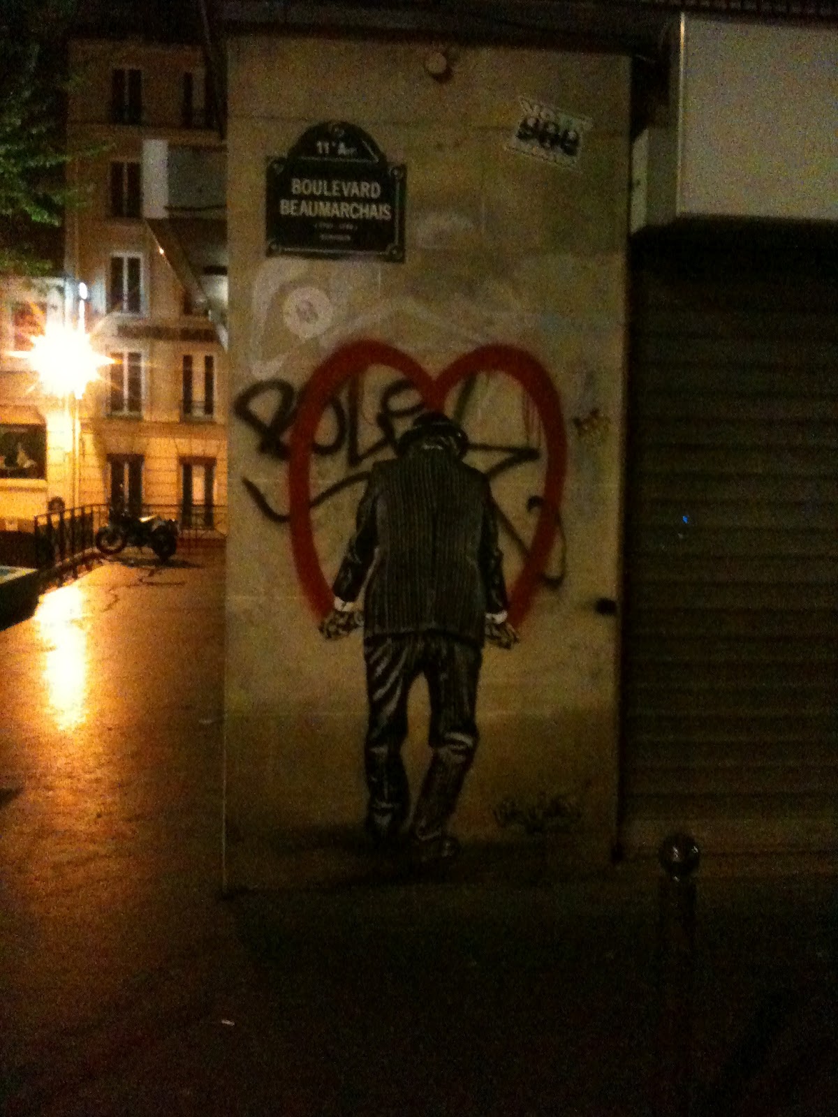
On my last night in Paris I saw this brilliant paste-up/grafitti. And it was exactly what I felt like doing. Just draw a huge heart onto the most magnificent city in the entire world. 
(Maybe by Leo&Pipo...? Not sure.)


In Bulawayo, Zimbabwe, I came across a to me formerly unknown artist who does beautiful work. As far as I understood Stanley Sibanda mostly paints rural scenes and landscapes with oil on canvans. I'll do a seperate post on him later, so I?m not going to spill all the beans.


Berlin, Kreuzberg. This huge astronaut-stencil is a real eyecatcher and you really wonder how someone did that. I mean, it's huge. And it's on a wall. Really high up there...  


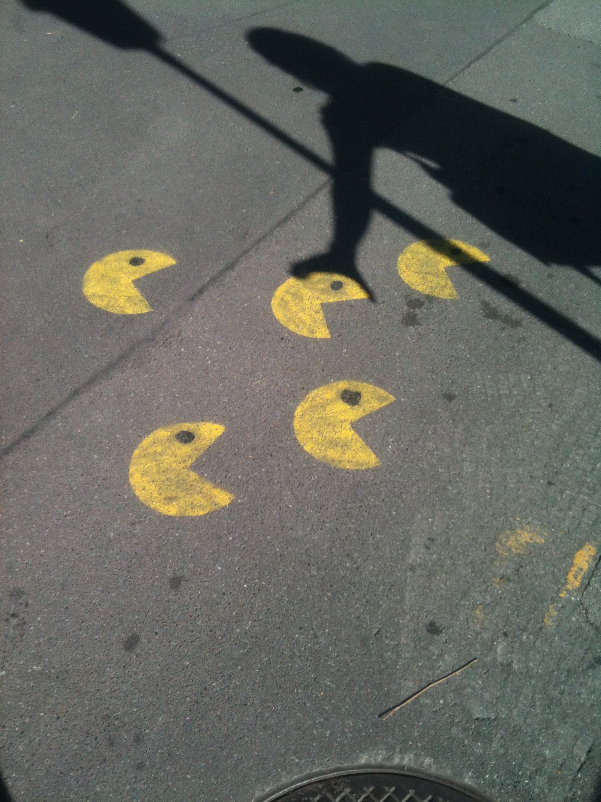
Thun, Boardwalk. Don't let the pacmen get you. Amazing.


And back in Berne, finally. Not much changed, but I did discover a new decoration in a rather public space. This little dinosaur made me smile. Plus, also a political statement, because, you know, it's Berne, the capital. 


Samstag, 30. Juni 2012

Not the Jeans...


Good Morning,

I think it‘s really important, especially for galeries, that they have an interesting display or poster or some sort of eyecatcher in their windows or doors. If you don‘t notice something special about a place, or don‘t even notice that it‘s a galery, the galery is doing something wrong.
So when I was walking through the city and I noticed these wonderful photographs in the window, I was instantly intrigued. Maybe also because the name next to the photo was a name I knew. 
But it wasn‘t a name I came across in my endeavors in art, but in my other field of study - social anthropology. 
The name Lévi-Strauss, for most people, means a famous brand of jeans-wear. But every anthropologist associates something else with that name. Claude Lévi-Strauss was a famous sociologist and ethnologist in the 20th century, who died recently in 2009 at the age of 101 years. 


In this lifetime he undertook many explorations, mostly to southern America. Brasil was frequently visited by Lévi-Strauss and his associates for research where he also took the photographs which were on display at the „Defacto la Gallery“- Galery. The title of the exposition was „Mondes Perdus“ and it displayed all pictures he took during a reserach trip where he tried to find out, how the technical progress and urbanisation influences and changes the life and agriculture of the indigenous farmers in Brasil. All the pictures were taken by a Leica camera and most of them are portraits of indigenous people living in the rainforest.


The photos were beautiful and very expressive, an effect that was enhanced through the black and white-styled pictures. My dad would have loved the exposition. Simple, expressive photos. 

Donnerstag, 28. Juni 2012

Marilyns Hand.


Grüezi Readers,
I have to confess, I was prejudiced. I went to the Centre Pompidou again, with visitors, and I dont know if I had a bad day or something, but I didn‘t really enjoy it. I know, I shouldn‘t or people in general shouldn‘t be snobby about art, but on this particular day I walked through the rooms and thought „this is art?“ „I could do that“ „why is this in here“ „this is a waste of space“.... You get the point.
And when I walked to this piece I thought it was a joke. Just random lines and squiggle-squaggles - and that was supposed to be art? I went to the description to find out who‘s responsible for this nonsense. 


And I was amazed!
It wasn‘t just random squigglings but someone, well not someone but Pierre Bismuth, actually had a pretty amazing idea! The artist and cameraman was born in France in 1963 and is also an awardwining screenwriter. This would explain the collaboration of painting and movies in his art.
The work is called „En suivant la main droite - de marilyn monroe dans 'some like it hot‘. And I guess you can imagine now what it is. Bismuth put a tracing paper on his tv-screen and followed for the length of the movie „some like it hot“ the right hand of the actress and icon Marilyn Monroe. What a funny idea.


So instead of calling out and idiot-wannabe-artist I got called out for being ignorant and snobby. Served me well, lesson learned.

Montag, 25. Juni 2012

The Moretti - No, it's not a drink.

Hey there,
One thing I hadn‘t done until now (shame on me) was visit La Défense. It is a businessquarter in the north-east of Paris. It is the elongation of the Champs-Élysées and it end with the modernist huge Grande Arche. La Défense consists of lots of Skyscrapers, Bureaubuildings, Shopping- and Businesscenters. It has, in contrast to the old parts of Paris, a very modern and steril feel to it. But it was worth the trip! 
In the middle of the busy lunchhours something caught my eye. From far away it looked like one of the skyscrapers but as I went closer, I saw that it was a huge cylindrical sculpture. It was made out of a lot of different colored and sized pipes and fit perfectly into the line of skyscrapers. 


It was called „The Moretti“ after its inventor Raymond Moretti. He created it in 1990, especially for La Défense - and besides it being a wonderful piece of art, it also serves as an industrial chimeney. Brilliant! Moretti was a french painter and sculpturer friends with famous artist of his time, like Picasso and Cocteau, with whom he shared close personal and professional relationships.


„The Moretti“ was a wonderful splash of color in the otherwise grey Défense. I enjoyed it quite alot.

Freitag, 1. Juni 2012

Louis and Marc.

Friends of beautiful things,

I went to see an exhibition at the Musée des Arts Décoratifs that no girl, or man for that matter should miss. It's a tribute-exhibition for Louis Vuitton and Marc Jacobs, two of the most influental and trendsetting individuals of their times.


The exhibition was organized chronologicaly, from the very beginning of the Vuitton-Emporium to the reign of Fashion-Superstar Marc Jacobs.

At first there was only a man and his brilliant idea to provide the proper packaging and transport for the new and upcoming fashion-craze. Louis Vuitton built suitcases, that fit entire wardrobes, toiletries and whatever else a true lady or gentleman needed at that time. He started his buisness for "articles de voyages - trunks and bags" in 1854 in Paris.


It was only Louis' son, Georges, who took the company further, and expanded into international business and created the famous LV monogramm that is stil used today.

The second part of the exhibition was a view on the current state of the Louis Vuitton Brand under Head-Designer Marc Jacobs. The concept of the upper floor was completely different from the traditional displays of the era of Louis Vuitton. It was flashy and poppy with videowall that show Jacobs' inspirations. And it even had a warning for parents at the beginning, that the material could be inappropriate for kids. Oh well...


It was mostly fashion, amazing handbags, purses, clutches etc, shoes and a history of Marc Jacobs' rise to one of the most important people in the fashion business today. No wonder, his creations, ideas and visions are magnificent and the displays were beautifully arranged and made every girls heart skip a beat.


It was weird, colorful, crazy and amazing - just as fashion today should be. At least that's my opinion.