Posts mit dem Label Gemälde werden angezeigt. Alle Posts anzeigen

Freitag, 5. April 2013

Spanish Impressionism

Welcome once again,

This time, my way lead me to Valencia, Spain. I went to visit a friend and of course as part of my mandatory city discovering program several museums were on my plan. My first stop was the Museum of Fine Arts of Valencia. Beautiful, beautiful building by the way!

Apart from the permanent collections, there was a wing solely dedicated to a Valencia-born artist. Joaquin Sorolla y Bastida (1863-1923) exelled at painting portraits, landscapes and works of social and historic themes. The exhibition showed a wonderful selection of some portraits he painted, but also some social themes. He painted in an impressionistic way, very expressive and bold, with vibrant colors. This one, painted in 1900 of Count Artal, made me stand infront of that portriat for a very long time, which rarely happens, since portrait is not my favorite medium of painting.


I love how the picture is divided into different sections by the various lines and diagonals throughout. I love the format, I love the vivid, yet rather undefined background, i love the placement of the portrayed. Beautiful picture.

But another picture I couldn't take my eyes off, was "People in frock coats playing in a garden" which Sorolla completed in 1900.


Isn't it just breathtaking?? I have rarely seen an impressionist painting with so much life in it. The colors are so rich and lush, not only in the depicted nature but also on the people and their costumes. Incredible how Sorolla captured the early autumn sunlight shining through the tall trees and falling on the playful scene. It seems like you can almost smell the freshness of the leaves, the crispness of the air this scene takes place in. What you can't see here, is the format. The picture is actually really huge so it seems, like you're standing right infront of that scene, participating almost in the joyful play. And look at that detail!! 


A true masterpiece!!

Freitag, 8. März 2013

Not ever ForgITTEN again

Fans of color, hello!

Tonight I had the opportunity to visit the exhibition "Itten and Klee" in the Kunstmuseum in Bern, guided by one of the curators herself, Monika Schäfer. 

I have to admit, I hadn't done any research beforehand and I had never heard about "Itten" before so I didn't know what to expect. Is "Itten" a place? A theory or idea? Or is it maybe another person? Pretty soon, almost immediateley it was clear to me, that "Itten" was also an artist of the same era as Paul Klee (1879-1940). Johannes Itten (1888-1967) is also, like Klee, a swiss artist from the 20th century. Not having heard from him before shamed me a little since his works, as I learned, are quite extraordinary. 

The theme of the exhibition was color itself. The cosmos of color to be exact. Both artists spent an enormous amount of time studying colors. Several rooms of the exhibition were just dedicated to show their theoretical approach on color. They both were groundbreaking in our modern understanding of color, colorschemes, colorinteraction etc. And both artists worked their findings on color and their experiments into their works. In a very systematic, almost mathematical way.

The great thing about getting led through an exhibition by someone who created it, is that you get to hear alot of anecdotes. For example one about this piece "Encounter" from 1916 by Johannes Itten. It seems quite systematic, clear composition, colorful. Eventhough you can't see an actual object or something in perticular there is a rather sad backstory. A close personal friend of Itten had taken her life, shortly before this work originated. The greyish spiral that represents the tragic loss meets the more lively and colorful spiral in an intertwined "Encounter". This piece represents a great deal of pain on the artist's part. 

Since I haven't really encountered Itten before, I will focus on another series of works by him, which I thought was enchanting. "Spring", "Summer", "Autumn" and "Winter" are four works of a series from a private collector that were created in 1963. You can again see the focus on the demonstration of colors and how they work together. Itten, more than Klee, also tried to apply the study of colors to other fields of sciences or areas of different focuses. For example he tried to categorize different signs in colors, or feelings and even traits of character. This series although represents his application of color to the different seasons of the year which in my opinion he managed to achieve beautifully. 


Dienstag, 5. März 2013

Checking out Chagall

Hi again there,

So there is a pretty big and as it seems important Marc Chagall exhibition at the Kunsthaus in Zurich. As you can imagine I was one of the first ones there. When I began my studies in art Chagall was my of my favorite expressionist painters. The colors and the melancholic tone of his pieces were always something that spoke to me. So naturally I was full of anticipation.

The exhibition was beautifully arranged, as the Kunsthaus always manages to achieve with its shows. The selection of paintings was broad and as I learned it took over two years for the curatorial team to aquire the works, coming from all over the world, from private collections, museums and galleries.

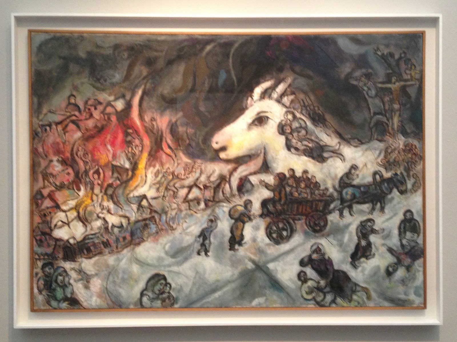
The War 1964-1966

The exhibition focused primarily on the years from 1911 to 1922, a crucial period in Chagall's artistic formation. Over 90 works trace his career in Paris and in is homeland Russia during the period of the revolution. Uniquely among his contemporaries, Chagall developed an art that articulates his Jewish and Russian culture while entering into a dialogue with the visual languages of modern art - from Fauvism to Cubism and Orphism, from Expressionism to Suprematism.

I know I said Chagall was one of my favorite artists when I started at University. But as I was looking at the pieces now I couldn't find the access I used to have to Chagall's poetic, intuitive, almost dreamy pieces of art. Before I found the famous flying cows and violin-playing goats, the floating lovers intriguing and beautiful. Now I found them rather silly, which I know I have no reason for. It all seemed more illustrative, almost childish and the colors seemed to vibrant and intrusive for me.

The Yellow Room 1911

But still, the quality of the works, the selection and the exhibition itself was great and of extraordinary quality. It was also the first time that so many works of different timeperiods of Chagall were united in one room which was a pleasure to see.


Freitag, 29. Juni 2012

Saint Anne vs. Mona Lisa

Bonjour mes amis,

During one of my latest visits to the Louvre, I decided to see the exhibition "Saint Anne, Leonardo Da Vinci's ultimate masterpiece".


It was a wonderful expo displaying not only one of the most famous paintings in the world, but also the process of a painter, from the scetch to the finished masterpiece, which is quite unusual.

"The Virgin and Child with Saint Anne" is a large-format painting which was started by Da Vinci in 1501. He kept working on the ambitious masterpiece during his life up to his death in 1519.


The exhibition showed the long and thoughtful process of Da Vinci leading up to the final version. The show combined all known scetches and paintings of the iconographical subject of Saint Anne and her daughter Mary with her grandson, Jesus, by Leonardo.


Not only did the exhibition show the process leading up to the masterpiece, but it also showed how the painting influenced italian art in the 16th century and also more recent artists like Delacroix, Degas or Ernst. They all created new versions of the theme Da Vinci rediscovered. A truly art-historical approach to a painting.

And I got some humor out of the titel of the exposition considering that the Louvre is also homing the "Mona Lisa" by Da Vinci. But the curator funnily chose to name the "Saint Anne" Da Vincis ultimate masterpiece instead of the famous Joconde. Bold. I love it.


Donnerstag, 28. Juni 2012

Marilyns Hand.


Grüezi Readers,
I have to confess, I was prejudiced. I went to the Centre Pompidou again, with visitors, and I dont know if I had a bad day or something, but I didn‘t really enjoy it. I know, I shouldn‘t or people in general shouldn‘t be snobby about art, but on this particular day I walked through the rooms and thought „this is art?“ „I could do that“ „why is this in here“ „this is a waste of space“.... You get the point.
And when I walked to this piece I thought it was a joke. Just random lines and squiggle-squaggles - and that was supposed to be art? I went to the description to find out who‘s responsible for this nonsense. 


And I was amazed!
It wasn‘t just random squigglings but someone, well not someone but Pierre Bismuth, actually had a pretty amazing idea! The artist and cameraman was born in France in 1963 and is also an awardwining screenwriter. This would explain the collaboration of painting and movies in his art.
The work is called „En suivant la main droite - de marilyn monroe dans 'some like it hot‘. And I guess you can imagine now what it is. Bismuth put a tracing paper on his tv-screen and followed for the length of the movie „some like it hot“ the right hand of the actress and icon Marilyn Monroe. What a funny idea.


So instead of calling out and idiot-wannabe-artist I got called out for being ignorant and snobby. Served me well, lesson learned.

Montag, 14. Mai 2012

For the mothers

Dear mothers,

Since it was Mothersday yesterday, I thought I'd do a post about a picture of one of the most famous mothers in art: Anna Whistler. Or better known as James Abbott McNeill Whistlers Mother or "Arrangement in Grey and Black No.1" from 1871. It also hangs in the Musée d'Orsay at the moment as is one of my favorites!


This very atypical portrait was actually created almost by mistake. From letters we know, that the original model who Whistler was supposed to paint that day failed to show up. Whistler then suggested that he'd paint his mother. But because of her old age she failed to take the originally intended standing pose and Whistler painted her sitting and in profile. A lucky change of events! The "Arrangement in Grey and Black No.1" is the most famous painting by this otherwise less known american painter and founder of Tonalism.

(Tonalism describes an artistic style that emerged in the 1880s in the US where the artists painted landscapes in one overall toned athmosphere and mist)

Ok, so this is the famous mother I thought of, but I also enjoy very much the oncoming summer and warm weather and overall colorfulness and playfullness of the current season, which isn't very well represented in this painting - as it is called "Arrangement in Grey and Black". So when I checked on one of my happy-feeling-artists i found this:


My favorite Balloon-Artist Larry Moss did a replica of the original - but with balloons!! This is way more in the spirit of how i'm feeling these days. All happy! But no, seriously, Larry Moss started out as a streetartist in New York and is obviously amazing and he recreates famous paintings in art history with balloons. He's great if you want to check him out! He doesn't only do art-replicas but also alot of different balloon-art and -objects. Yay!

And I also want to mention my own mom, who is wonderful, lovely and amazing and should also have her own portrait made into balloonart! Happy Mothersday!


Donnerstag, 10. Mai 2012

Olympia.

Hello Friends,

I must tell you, it is very fun to (sometimes) actually understand art. And to understand what a piece of art you've never seen before is referring to, critizing, meaning, saying etc.

So when I saw this piece at Pompidou I very much enjoyed it, because I knew something about it (which is sometimes hard with the things at Centre Pompidou - sorry)


Maybe you know the original masterpiece on which this quite funny artist is basing his wood and plastic sculpture on? Larry Rivers, an US-artist, created this piece in 1970 under the name of "I like Olympia in black". 

It's funny, because most artworks that quote another piece do not make it that obvious. Ok, I'll solve the mystery for you if you still don't know which piece was the inspiration for this. It was the very famous Edouard Manet, who painted the famous "Olympia" from 1863-65 (which currently hangs at Musée d'Orsay here in Paris).


As you can see now, Rivers clearly took Manets painting as basis for his own work. The woman, olympia has the same posture, the bed is the same, and also the servant. The great thing is, that he duplicated the entire thing he built in wood and turned the colors around - hence the title of Rivers' piece. Olympia isn't white anymore, shes's black and is now being served by a white maid. Even the cat in the right bottom corner had to switch colors. It is obviously a statement against the skincolor-bias between servants and employers, or the skincolor-bias in general.

A really witty example of turning something old in something contemporary in a new way! 


Donnerstag, 3. Mai 2012

Come very close!

Oh hey there you are,

I just want to tell you about an artist I discovered for myself real quick. His name is Oscar Camilo de las Flores and he is a mexican artist born in 1974.

I saw his works in the Collection of the Museum Boijmans Van Beuningen which is on tour right now with their contemporary surrealistic drawings.

There were four independent works that made a series. They were drawn on paper with a regular pen and ink. The works range from 2008 to 2009.

So first of all here is how it looks from far away:


Then like this:


And now some details:


Obviously I took details of comics - because I love comics. But you can really see the skill and time the artist used to create these works. The detail, the finesse and the style is just incredible. You can really see the surrealistic tendencies since your automatic imagination gets triggered the moment you look at the drawings of de la Flores. The themes are linked to the history of his country, art history and modern societies problems. It's very dark and grottesque which fits perfectly to the trend of art right now whilst the works are in the surrealist tradition. Very interesting, this artist.

Dienstag, 1. Mai 2012

Flemish.

Hey there,

So after all this modern art, I thought I needed some more accesable art. And by that I mean paintings. Paintings are probably my favorite medium of art, since they are the most traditional.

So I've heard about this small exhibition about flemish art at the Institut  Néerlandais, the Netherland's Cultural Institution in Paris. It was called "Un Univers intime. Tableaux de la Collection Frits Lugt" and it was A-MAZING!! First of all it was the perfect sized exhibition so you could totally enjoy and take all of it in. Second it was kind of a secret tip, so there weren't as many people. Very pleasant. Third - the space was absolutely beautiful and put to good use. And then, fourth, I have never seen an exhibition guide be so good. Seriously, it was one of the best organized, planed, executed and best explained exhibition I ever had the pleasure of visiting! Plus I really enjoy that era of painting so that was a bonus aswell. Frits Lugt mostly collected flemish and dutch paintings and artists of the golden age and gives a wonderful overview of painting in that time and area.


One painting that especially caught my eye was a tableau "Festoons, Masks and Rosettes of Shells" by a so far unknown artist to me, Jan van Kessel Senior in 1656. It a very peculiar display of alot of differnet kinds and types of seashells. The shells in the picture are arranged so they build different kinds of festoons, masks and rosettes. It is the only known work that represents so many different kinds of decorative and anthropomorphe assemblies of shells at that time. You have to imagine, that at that time it was not easy to have a full knowledge of different kinds of domestic and exotic shells. The artist probably had to collect and find and make sketches of shells for a long time to aquire such an extensive collection of shells. It made me be amazed and giggle at the same time! 


Of course there were alot of traditional flemish landscapes and peasant-life themed paintings and also some portraits. But the oeuvre by Kessel Senior was my favorite one.

Mittwoch, 25. April 2012

A History in an hour.

Oh wonderful readers,

I can't say it enough - Paris is great! I mean, just the other day I was walking around in the Marais as suddenly the biggest rainstorm broke loose! It pourred down rain and in my search of shelter I just jumped into the nearest dooropening. And yes, it was a museum.

The Musée Carnavalet is located in a beautiful old mansion that served as manor for one of the oldest families in France and then as a hotel. It is beautiful and has an even more stunning yard in its court. So there I was, standing in a Museum. Of course I was going to look at it!


It is, as I discovered, a rather famous parisian history Museum that displays the history of France, and especially Paris through different artifacts. It takes you on a tour through time as you walk through the different rooms who are all decorated in the way of the time displayed and discussed in that particular room. Very charming. After you've seen several pieces of furniture of different time eras (and that really closely - more close than you could ever get in those big Museums!) you get led into the changing exhibitions space which harbours some lesser known historical painters and artists and changing expositions.

One piece in particular caught my eye since the person displayed is very a-typical for the way it's painted.


It's a piece by Robert Humblot of "Juliette Greco" the famous french singer and actress, in 1956, right next to some brilliant impressionist works. I loved the pose of the woman, holding a very strange animal, a cheetah, and wearing an even more bizarre outfit. The greys and blacks of the painting had a wonderful effect with the burgundy red of the wall. It seems like a normal portrait painting in the tradition of historical portraiture - apart from the obvious modern influences like clothes, hairstyles and weird pets. But the pose of the woman, the plain background and the important "accesoire" (here the pet), to describe the character of the woman, all remind us of a classical portrait.

And, as it was almost closing time, I rushed, sadly, through the rest of the wonderful Museum only to find this at the end:


A stunning hall, completely painted and furnished to create an overall look and impression of a majestic ballroom in the Art Noveau Style. Wonderful. Just wonderful.

It should rain more often if this is the result. 


Montag, 23. April 2012

Dark Art Paris 2012 in a Light Grand Palais


Hey Fun-Friends,
This year the Grand Palais was host to one of the most famous artshows in France and maybe the world. Art Paris was/is back in town!!
A place where the leading galleries and institutions display the current trends and the upandcoming new artists! What a marvel. Plus, the Grand Palais is just unbelievable in beauty of construction! Me and my enthusiastic friend managed to find a time where we both could make it so we ended up going two hours before it closed. That decision ended up to be very smart since almost everyone had gone home allready and the eveningsun flooded the entire glass-covered Palais.


The beauty of the setting wasn‘t displayed in the works though. The art was mostly very gloomy, dark and scary with a strong hint of voyeurism. At some point you even get turned into one yourself:

You felt observed and followed and the works were dark and frightening. There was a lot of deconstruction of images aswell and ugly materials like trash and old iron made into new pieces of art. If you really want to call them that.


There were some colorful and pop-arty works, which makes sense because neon-colors aren‘t only in style in fashion right now, but also in art, but there was always a certain edge to them. For example this galery who displays an artist who took violant themes, like guns and munition and turned them pretty.

But overall it was still a beautiful artfair with beautiful pieces and a strong fotorealism and sculpture trend.

Freitag, 20. April 2012

Monets Masterpiece!

Bonjour mes amis de l'art,

The Musée de l‘Orangerie is one of my favorite places so far! It is so incredibly beautiful, that you actually do not want to leave - ever! Of course I‘m talking about the two oval rooms where the astonishing paintings by Claude Monet are displayed. The paintings of the famous waterlilies were actually painted especially for those rooms. It is wonderful. I won‘t bore you with details because this is really something everyone needs to see for themselves. So here are some pictures to give you a little preview.


In addition to the waterlilies you can view the collection by the famous artpatron Paul Guillaume which includes Matisse, Renoir, Picasso, Cézanne and Modigliani. It is an overviewable selection of high quality works that really leaves you wanting more if anything else. Wonderful. 
At the time there was alo a temporary exhibtion about Debussy and how different artists influeneced his musical career and work. A really well organized and fluent exhibition - much like Debussys music itself. Quite intruiging actually. There were pieces of art, paintings and such, artefacts of that times like musical instruments, letters and notes plus photographs. And everything was of course accompaigned with Debussys beautiful classical music. If I hadn‘t walked right to that exhibition I probably wouldn‘t have chosen it, but now that I‘ve seen it I‘m glad I did. If that makes sense. Go see it is what I mean.

Donnerstag, 12. April 2012

Sea of Tranquility

Dear artsy ones,
Ah yes, the famous Musée d‘Orsay. I had the pleasure to visit it several times last month, due to alo-hot of people who came to visit me in the best city in the world!
So - Musée d‘Orsay. It is the place, that harbours most of my favorite art. It is huge and always attracts alot of people. Everytime I went, there was a line of at least 30 minutes. Which doesn‘t really matter, because it IS that good. Not like the stupid Louvre. 
The current exhibition in addition to the amazing permanent collection was about „Degas et le nu“ which wasn‘t as good as I had hoped. There were way too much sketches and very little large scale works displayed in a too little space with horrible lighting. A little disappointing. 
But after the, let‘s say average, exhibition you have the entire rest of the wonderful Musée D‘Orsay at your feet. Because you could never look at everything at once, I chose the orientalist section on the ground floor. Breathtaking! Orientalism was triggered by the discovery and access to a new world through Napoleons egyptian campaign. It was also in that time, where the painters removed themselves from unrealistic visions of the orient and began to discover a new palette of colors, landscapes and people that resulted in a very romantic portrayal of the land where the sun rises. 
The Museé d‘Orsay mostly shows paintings of landscapes and animals in the orientalistic manor, like those of Guillaumet and de Tournemine. 
Charles Emile de Tournemine Painting - Cafe in Adalia
Sadly, one of my favorite romantic orientalist pieces isn‘t displayed at Orsay. It is Delacroix‘ masterpiece "Women of Algiers". A lucious display of the inside of a Harem. Beautiful women dressed and drapped in even more beautiful textiles, smoking the waterpipes. It‘s a painting that oozes calm and tranquility without forgetting the hot and eroticly charged surroundings. Amazing!

And then there is the beautiful building that is the Musée d‘Orsay. The old railwaystation that grew out of need is a perfect place to house one of the greatest collections of modern and impressionist art. The clocks and fassades are masterpieces of their own and are almost as iconic as the works inside. 

Freitag, 6. April 2012

Giorgio De Chirico

Good Day amazing ones,

One of my personal favorites and earliest encounters in my studies was Giorgio de Chirico - one of the greatest surrealistic painters!

Much to my delight I discovered that the Musée de l'art moderne de la ville de Paris has a wonderful collection of de Chirico.

One of the things I love most about this paintings are the intense colors - especially the marine blue and green tones. I think his portrayal of archtitecture is brilliant and the different elements in the painting mostly make sense - not like the other surrealists' paintings. Tzz...
What's also always striking me is the feeling of extreme loneliness and solitude that comes from his works.

So here a selection of some amazing works by de Chirico, I'm not gonna bore you with more talking and just let the works talk for themselves.


Samstag, 31. März 2012

More Tradition now...

Lovely art-lovers,

I will tell you today, what my favorite museum in Paris is (so far). And of all the ones that you should see or know!

Musée d'Art moderne de la Ville de Paris.

It's just... grand! Amazing, lovely, beautiful, well built - everything you'd want in a museum! It mostly displays modern and contemporary art in a permanent collection but it also has changing exhibitions. When I visited the museum for the first time it was a sad, grey, rainy, cold day. Perfect for a museum - plus I felt a little down and a visit to the museum always cheers me up! Aaaanyways, so I went and the first thing you notice is the great location. You have a really pretty view on the Eiffel Tower and it's right at the Seine, so a lovely walk. The second thing is, when you can actually take in the entire and monumental building! The building, which is calles Palais de Tokyo, has two wings and the musée is in the right one. It was built for the International Exposition for Art and Technology in 1937 and the official opening of the musée was 1961. The building was created in a neoclassical style which is instantly clear when you see its fassade with the big columns and the cubic appearance in the ancient greek tradition.


As I entered the building I kindof had an idea of how the inside would look and to be honest, I was a little worried. The building stands so tall, like an erratic block, demanding so much respect and almost making you fear it. But the inside were lovely! The rooms were high, but not to big, there were niches for the various artist and it had a really nice flow to it, there was a given route or circuit if you will - which negates the cubist appearance of the museum! The lighting was amazing, there were no reflections on the paintings and the pieces were extraordinarily well hung! But that's not all! The quality of the artwork was really really high and it gave you an amazing overview of the eras and of the artist that were displayed. You never got tired or felt lost in the museum which is quite an accomplishment - well done!


And one thing I also really enjoyed was the amount of people in the museum. There weren't alot of people... Which is nice, you get to actually take in the pieces of art and think about them and take your time without worrying if you're bothering someone. Very, very pleasant. But I guess also kind of sad, because the best museum (at least in my opinion) goes unnoticed by the broad public.

Dienstag, 20. März 2012

S'up Art-Fans. Relocation. Salut les enthusiasts de l'art

Sooo, I'm very very sorry, that I haven't been posting more of my semi-amateur artstuff but yes, I moved. All in the name of art!! Indeed I did. I moved to PARIS! So I'll be posting somewhat interesting and definetly local cultural news from the capital of Art (and France) from now on.


So, what does every art-fan do, when they first get to Paris? Yes - it's an unspoken law, you have to go to the Louvre. THE Louvre. The mother of all museums, the queen of artexhibtions and archeology, the biggest museum in the entire world. So I went, it was snowy out (that's how long ago) and it was the same. The same as always.


So here my confession: I don't really like Le Louvre. I think it's way too big, way too full, too loud, the pieces are displayed poorly and even the selection doesn't make my heart beat faster. Obviously I do sometimes still visit this grande maison de l'art but I have to say, I do not really enjoy it. As stated before, there are always way too many people there - and all they want to do is see the famous Mona Lisa. They rush to this painting, which I don't like either by the way, take a quick snapshot from like a million miles away, you can't even see anything because the glass is so thick and the lighting is horrible. And whilst these snapshotchasers do this, they miss the actual highlight of the room. Behind them, vis-a-vis of Mona Lisa, that sneakily smiling minx (sorry Da Vinci) hangs a sensational painting: The Wedding of Cana by the great master Veronese. Breathtaking! And most people just miss it, it's a shame...


What I do enjoy about the Louvre though, is the clever architecture. The famous Pyramids by equally famous architect Ieoh Ming Pei are a marvel. It definetly was a risk to combine such an important and historic building with the modern, very contrasting glass Pyramids. And I also enjoy the great collection of Flemish paintings, for I did my thesis on Rubens. Wonderful works by Rubens!


Sorry for starting my parisian art-reviews with a rant, but there are far more fascinating things to be discovered than same old - same old Louvre. Which is obviously still great. Just not one of my personal greats. D'accord... Â bientôt!

Montag, 5. Dezember 2011

Nahmad Collection

Good Day culture fans,

I went to visit an exhibition I waited for a long time to come to Zurich. As a fan of modern art, impressionism, expressionism, cubism, surrealism... I was excited to hear, that the Nahmad family decided to make their private collection of modern art pieces public and the Kunsthaus Zurich jumped on the opportunity to display this extraordinary collection.

I won't bore you with a lot of details now, but it was a fantastic exhibition! There was everything a fan of modernists could want to see! Picasso, Miro (and a lot of it) , Kandinsky, Monet, Matisse, Modigliani, Cezanne and of course the surrealists Ernst, Dali and Magritte, who's sausage was the official poster. So much fun!

I also adored the way the Kunsthaus presented the collection. There were different sections, the rooms were themed and the walls were a dark grey. It looked stunning and really left the focus on the beautiful pieces of art. What I also enjoyed was that most of the works were framed in beautiful baroque golden frames, which gave the collection a sense of collectiveness, eventough such a broad time period was displayed.

Here's my favorite picture of the day. I took it, because I thought it was brilliant how the older guy focuses on this iPhone and the young guy reads the catalogue (and has amazing socks just by the way). The colours are very greyish, except for the red details... and of course, one of my favorites: A beautiful cubist Picasso, in a golden frame. Brilliant!

Samstag, 3. Dezember 2011

Kunst '11 in Zurich

Hello artsy ones,

A little late I would still like to tell you, what I liked best about this year's contemporary art fair in Zurich, the "Kunst 11". Luckily me and my friend got the chance to view the fair on the pre-opening event, everything was still in place, all the important people were present to explain some stuff about their fields of expertise and some artists were present aswell, which I always love.

There was definitely a big focus on photograhic art, alot of photographs in their original states, but also a huge amount of edited pictures in every way possible. And of course there were some traditional pieces of art, paintings and sketches by long-established artist, modernist painters like Miro, Picasso, Klee and such. A trend also lay with quite excentric sculptures and light-installations. Those I can always appreciate, I especially found one piece by Christian Hardeg fascinating. Different coloured neon-light-pipes, which were fitted on a huge board. It looked, if you stood infront of it, as if you are standing on a bridge over a highway by night and thousands of cars are racing towards that bridge.


The thing that impressed me and my friend the most, though, was a young american artist. As we wandered through the different showcases of the galleries one picture caught our eye. It was a woman, a portrait on a red background.


As we came closer to the picture we saw the brilliance of this rather ordinary seeming portrait. It was not a painting as we thought, but a photograph! You can clearly see the hair and the eyes, but the rest of it seems painted. Alexa Meade, the artist, was there and explained to us, that she draws on people and objects, then takes a picture. I think that is an amazing merge between painting and photography and a real skill, to be able to do that. Of course, when I came home I googled this discovery! And I was fascinated... still am. Here some pictures:


As always, the visit payed off, we had a fun and fascinating night and some good glasses of wine. Success!